响应式图片展示卡 Expanding-Cards
1. 概述
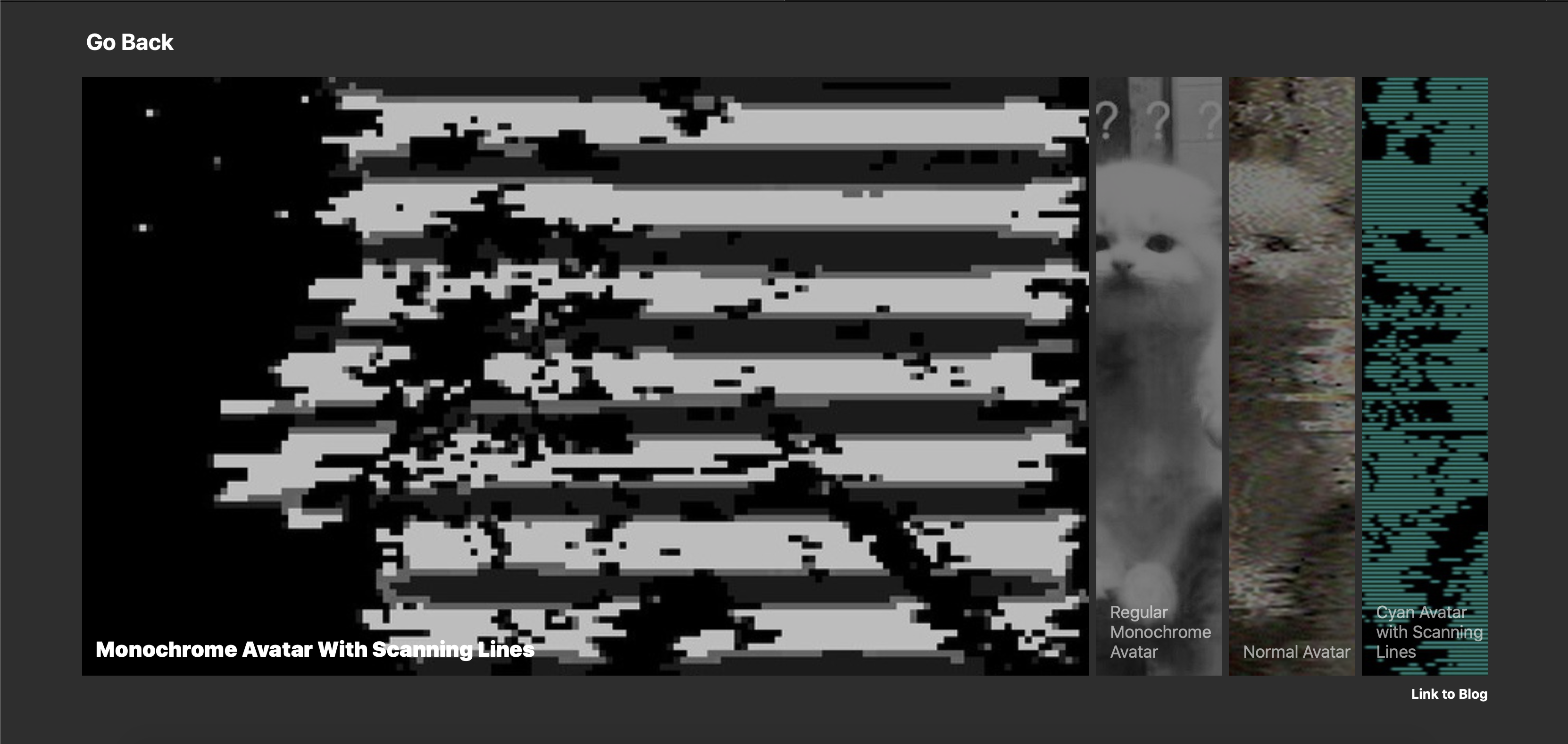
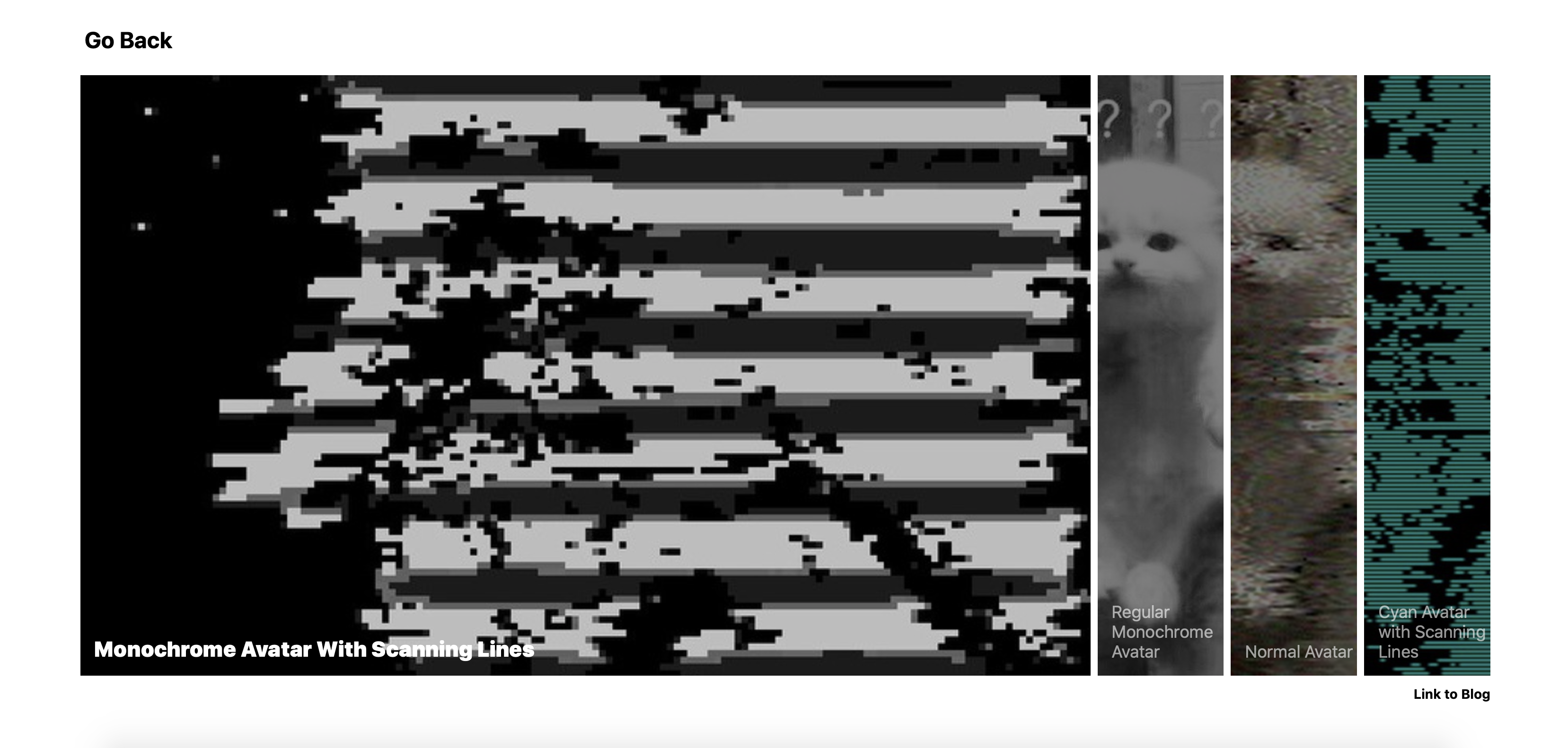
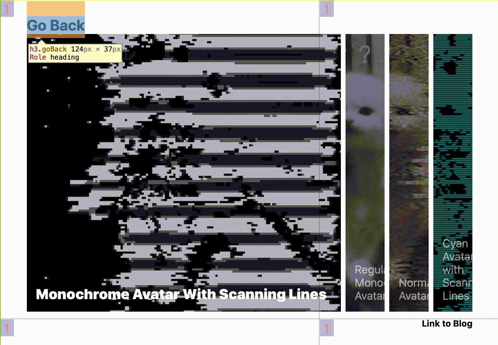
项目本体为一个响应式图片展示卡, 所展示的数张图片会随着用户点选而自动展开/折叠, 同时伴有描述文字的字体大小/字体粗细变化以及图片明暗度变化的平滑动画效果. 图片展示卡的左上角和右下角设置有两个链接. 背景和链接字体颜色受用户端操作系统内建的明暗模式控制, 会自动与之保持一致.
在本项目中, 将涉及如下知识点:
- 如何在一个
div里垂直并水平居中子div - 如何使用
position-absolute绝对定位, 并了解其定位规则 - 初步了解
css选择器 - 使用
transition控制渐变动画的时间和切换类型 - 利用
@media控制响应式排版和自动浅色/深色模式切换
效果:

2. 结构与切图
网页的基本结构如下:
1
2
3
4
5
6
7
8
9
10
11
12
13
14
15
16
17
18
19
20
21
22
23
24
25
26

<body>
    <h3 class="goBack" onclick="self.location.href='webSite 1">
        左上角文字链接
    </h3>
    <div class="container">
        <h3 class="motto" onclick="self.location.href='webSite 2'">
            右下角文字链接
        </h3>

        <div class="panel active" style="background-image: url('avatar0.JPG');">
            <h3>第一图描述文字</h3>
        </div>

        <div class="panel" style="background-image: url('./avatar1.JPG');">
            <h3>第二图描述文字</h3>
        </div>

        <div class="panel" style="background-image: url('./avatar2.JPG');">
            <h3>第三图描述文字</h3>
        </div>

        ...

    </div>
</body>
每一张图片和它对应的描述文字一起包含在一个 div 中, 这些 panel 类的子 div 又被统一包裹在一个作为容器的父 div 中, 其中该 container 类的父 div 水平, 垂直居中. 两个文字链接分别以 body 和 container 为其父元素 绝对定位.
3. 编写 CSS 样式
按照需求我们需要分别为不同类编写 CSS 样式:
1
2
3
4
5
6
7
8
9
body{
    font-family: -apple-system, BlinkMacSystemFont, 'Segoe UI', Roboto, Oxygen, Ubuntu, Cantarell, 'Open Sans', 'Helvetica Neue', sans-serif;
    display: flex;
    align-items: center;
    justify-content: center;
    height: 100vh;
    overflow: hidden;
    margin: 0;
}
在这里, 我们 使用弹性布局 display: flex 结合 align-items: center 与 justify-content: center 实现对 container 的水平, 垂直居中.
同时, 我们设定 margin: 0 避免在某些浏览器中显示该页面时出现白边.
1
2
3
4
5
.container{
    display: flex;
    width: 90vw;
    position: relative;
}
我们将容器的 display 方式设为 flex 使得其子 div 基于 Flex 布局沿容器的水平主轴排列.
为了使右下角的文字链接在使用绝对定位时将该容器而不是 body 作为其参考父元素, 我们设定 position: relative.
1
2
3
4
5
6
7
8
9
10
11
12
13
14
15
16
17
18
19
.panel{
    background-size: cover;
    background-position: center;
    background-repeat: no-repeat;
    background-color: rgba(0, 0, 0, .5);
    background-blend-mode: multiply;
    height: 80vh;
    color: #fff;
    cursor: pointer;
    flex: 0.5;
    margin: 5px;
    position: relative;
    transition: all .4s ease;
    overflow: hidden;
}
.panel.active {
    flex:4;
    background-color: rgba(0, 0, 0, 0);
}
下面进行图片面板的样式设定. 为了确保图片完全覆盖整个 div, 我们设定 background-size: cover 并将其位置设为 垂直居中. 为了避免图片在尺寸较大的屏幕上展示多次, 我们规定 background-repeat: no-repeat.
为了实现图片面板选中时展开, 未选中时折叠的效果, 我们调用 flex属性 规定它在这两种不同情况下如何增大/缩小自身宽度.
此外, 我们希望图片面板在未被选中时为图片加上一层阴影遮罩. 要实现这一效果, 我们有以下三种可选方案:
- 通过定位叠加: ~~~html
1
2
3
4
5
6
7
8
9
10
11
12
13
14
15
16
17
18
19

~~~css
.panel-outer {
    position: relative;
    width: 1200px;
    height: 400px;
    background: rgba(0, 0, 0, .5);
}

.panel-inner {
    position: absolute;
    left: 0;
    right: 0;
    top: 0;
    bottom: 0;
    background: url(avatar.jpg) no-repeat center center;
    background-size: cover;
    z-index: -1;
}
- 通过
CSS伪类叠加: ~~~html
1
2
3
4
5
6
7
8
9
10
11
12
13
14
15
16
17
18
19
20

~~~css
.panel {
    position: relative;
    width: 1200px;
    height: 400px;
    background: url(avatar.jpg) no-repeat center center;
    background-size: cover;
}

.panel::before {
    content: "";
    position: absolute;
    left: 0;
    right: 0;
    bottom: 0;
    top: 0;
    background-color: rgba(0, 0, 0, .5);
    z-index: 2;
}
关于 CSS 伪类, 详见CSS伪类和伪元素的用法 以及 CSS伪类的实例.
- 利用
CSS3的特性: 正片叠底:1 2 3 4 5 6 7 8
.panel{ background-size: cover; background-position: center; background-repeat: no-repeat; background-color: rgba(0, 0, 0, .5); background-blend-mode: multiply; height: 80vh; }
1
2
3
4
5
6
7
8
9
10
11
12
13
14
15
.panel h3 {
    font-size: 24px;
    font-weight: 400;
    position: absolute;
    bottom: 20px;
    left: 20px;
    margin: 0;
    opacity: 60%;
}
.panel.active h3 {
    font-size:30px;
    font-weight: 900;
    opacity: 1;
    transition: all 0.2s ;
}
随后我们设定图片面板上描述文字的样式. 为了实现图片面板被选中时其描述文字的强调效果, 我们分别对图片面板被选中和未被选中时, 位于其内部的所有 <h3> 元素样式进行分别规定. 此处注意 css 选择器语法 的使用:
为了确保文字始终位于图片面板左下角, 很自然地我们需要使用绝对定位.
1
2
3
4
5
6
7
8
9
10
11
12
13
14
.motto{
    position: absolute;
    bottom: -50px;
    right: 5px;
    cursor: pointer;
}
.goBack{
    position: absolute;
    top: 0.5vh;
    left: 5.5vw;
    font-size: 2em;
    margin-bottom: 10px;
    transition: .3s ease;
}
接下来设定文字链接的样式. .motto 为位于图片面板容器右下角的文字链接, 其位置以容器为父元素绝对定位; .goBack 为左上角的文字链接, 以 body 为父元素绝对定位.
1
2
3
4
5
6
7
8
9
10
11
12
13
14
15
16
17
18
19
20
21
22
23
24
25
26
27
28
29
30
31
32
33
34
35
36
37
38
39
@media (max-width: 480px) {
    .container{
        width: 100vw;
    }
    .panel:nth-of-type(4),
    .panel:nth-of-type(5){
        display: none;
    }
}
@media (max-height: 400px) {
    .motto{
        display: none;
    }
}
@media (max-height: 700px){
    .goBack{
        display: none;
    }
}

@media (prefers-color-scheme: dark) {
    body {
        background-color: rgb(46, 46, 46);
    }
    .motto{
        color: white;
    }
    .goBack{
        color: white;
    }
}
@media (prefers-color-scheme: light) {
    body {
        background-color: white;
    }
    .motto{
        color: black;
    }
}
最后我们处理整个样式表中最有意思的部分: 自适应浅色/暗黑模式切换和页面响应式. 此处的 CSS 代码作用不言自明, 故不做赘述.
需要注意的是, 在本项目的 CSS 表中, 还涉及到下列内容:
- 我们可以使用
cursor: pointer强制指定鼠标光标移到某元素上方时显示的光标类型为pointer. - 使用
overflow: hidden控制某元素内的子元素在溢出时, 溢出部分隐藏. - 使用
user-select: none禁止用户选中对应元素内的文本,Safari等WebKit内核浏览器需要使用-webkit-user-select: none. - 使用
transition: all .4s ease控制对应元素的过渡动画覆盖范围, 时间和类型. - 使用
opacity: 1控制元素不透明度.
完整的 CSS 样式表如下:
1
2
3
4
5
6
7
8
9
10
11
12
13
14
15
16
17
18
19
20
21
22
23
24
25
26
27
28
29
30
31
32
33
34
35
36
37
38
39
40
41
42
43
44
45
46
47
48
49
50
51
52
53
54
55
56
57
58
59
60
61
62
63
64
65
66
67
68
69
70
71
72
73
74
75
76
77
78
79
80
81
82
83
84
85
86
87
88
89
90
91
92
93
94
95
96
97
98
99
100
101
102
103
104
105
106
107
108
109
110
111
112
113
114
115
116
117
<style>
        *{
            box-sizing: border-box;
        }

        body{
            font-family: -apple-system, BlinkMacSystemFont, 'Segoe UI', Roboto, Oxygen, Ubuntu, Cantarell, 'Open Sans', 'Helvetica Neue', sans-serif;
            display: flex;
            align-items: center;
            justify-content: center;
            height: 100vh;
            overflow: hidden;
            margin: 0;
        }

        h3{
            user-select: none;
            -webkit-user-select: none;
        }

        .container{
            display: flex;
            width: 90vw;
            position: relative;
        }

        .panel{
            background-size: cover;
            background-position: center;
            background-repeat: no-repeat;
            background-color: rgba(0, 0, 0, .5);
            background-blend-mode: multiply;
            height: 80vh;
            color: #fff;
            cursor: pointer;
            flex: 0.5;
            margin: 5px;
            position: relative;
            transition: all .4s ease;
            overflow: hidden;
        }
        .panel.active {
            flex:4;
            background-color: rgba(0, 0, 0, 0);
        }

        .panel h3 {
            font-size: 24px;
            font-weight: 400;
            position: absolute;
            bottom: 20px;
            left: 20px;
            margin: 0;
            opacity: 60%;
        }
        .panel.active h3 {
            font-size:30px;
            font-weight: 900;
            opacity: 1;
            transition: all 0.2s ;
        }

        .motto{
            position: absolute;
            bottom: -50px;
            right: 5px;
            cursor: pointer;
        }
        .goBack{
            position: absolute;
            top: 0.5vh;
            left: 5.5vw;
            font-size: 2em;
            margin-bottom: 10px;
            transition: .3s ease;
        }

        @media (max-width: 480px) {
            .container{
                width: 100vw;
            }
            .panel:nth-of-type(4),
            .panel:nth-of-type(5){
                display: none;
            }
        }
        @media (max-height: 400px) {
            .motto{
                display: none;
            }
        }
        @media (max-height: 700px){
            .goBack{
                display: none;
            }
        }

        @media (prefers-color-scheme: dark) {
            body {
                background-color: rgb(46, 46, 46);
            }
            .motto{
                color: white;
            }
            .goBack{
                color: white;
            }
        }
        @media (prefers-color-scheme: light) {
            body {
                background-color: white;
            }
            .motto{
                color: black;
            }
        }
    </style>
4. JavaScript
最后我们需要编写 JavaScript 函数监测图片面板的点选状态, 并相应地通过修改面板的 className 切换其样式, 结合 transition 实现无缝的动画效果:
1
2
3
4
5
6
7
8
9
10
11
12
13
14
15
16
17
18
19
// declare an object (NodeList) containing every DOM element which class == 'panel'
        const panels=document.querySelectorAll('.panel')

        // add event listeners to each element
        panels.forEach(panel => {
            // first reset every element's className to 'panel'
            // then append 'active' type to its class if it is clicked
            panel.addEventListener('click', () => {
                removeActiveClasses()
                panel.classList.add('active')
            })
        })

        // reset every element's className to 'panel'
        function removeActiveClasses() {
            panels.forEach(panel => {
                panel.classList.remove('active')
            })
        }
最后, 完整的网页演示可见 此处