自适应进度阶 Progress-Step
1. 概述
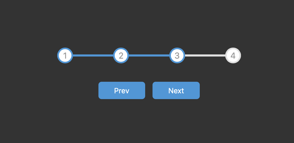
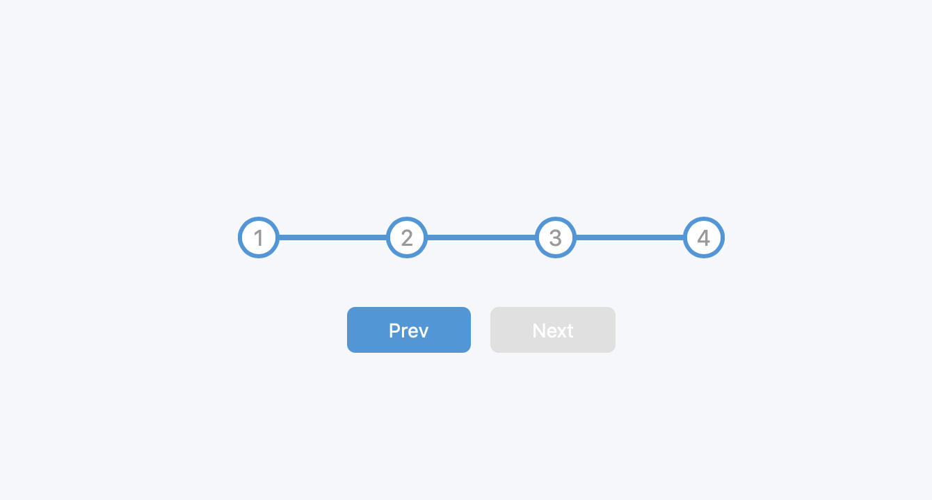
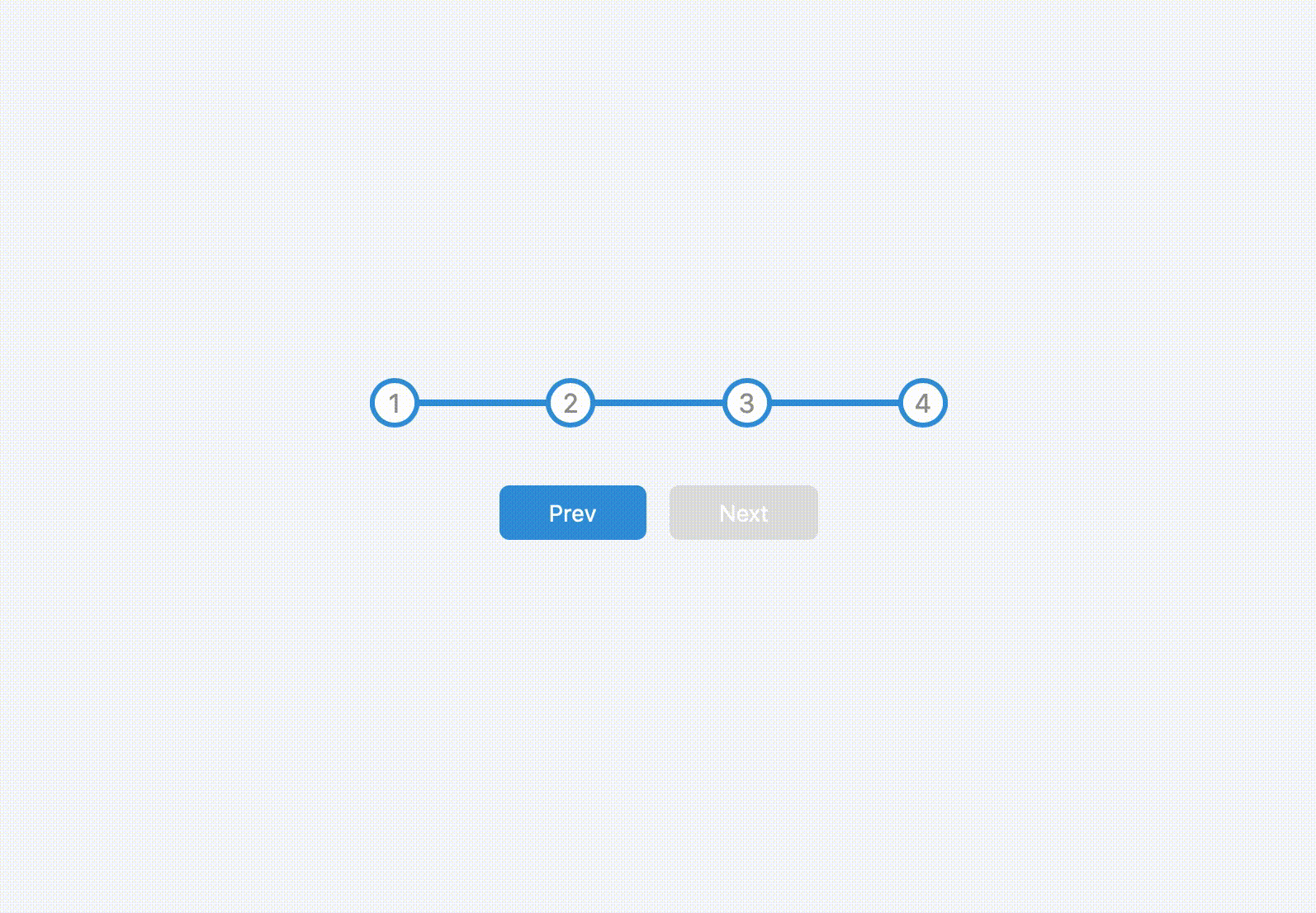
该项目本体为一个自适应响应式进度阶, 可通过按钮切换进度状态, 相应指示状态的数字圆框和内嵌的进度条会自行切换颜色.
本项目中将涉及如下知识点:
- 如何使用
CSS绘制进度条 - 如何使用
CSS变量
效果:
2. 结构和切图
我们还是从网页的基本结构开始:
1
2
3
4
5
6
7
8
9
10
11
12
13
14
15
16
<body>
    <div class="container">
        <div class="progress-container">
            <div class="progress" id="progress"></div>
            <div class="circle active">1</div>
            <div class="circle">2</div>
            <div class="circle">3</div>
            <div class="circle">4</div>
        </div>

        <button class="btn" id="prev" disabled>Prev</button>
        <button class="btn" id="next">Next</button>
    </div>
    <script>
    </script>
</body>
进度阶由一个进度条和数个指示当前进度阶的文字/圆环组合而成, 包裹在一个 progress-container 容器中, 两个按钮和该容器一起被统一包裹在一个更大的 container 容器中, body 定位方式为 flex, 并通过将 progress-container 宽度设为 100% 实现换行.
3. 编写 CSS 样式
按照需求我们需要分别为不同类编写 CSS 样式:
1
2
3
4
:root{
    --line-border-fill: #3498db;
    --line-border-empty: #e0e0e0;
}
首先声明两个存储色值的 CSS 变量.
1
2
3
4
5
6
7
8
9
10
body{
    background-color: #f6f7fb;
    font-family: -apple-system, BlinkMacSystemFont, 'Segoe UI', Roboto, Oxygen, Ubuntu, Cantarell, 'Open Sans', 'Helvetica Neue', sans-serif;
    display: flex;
    align-items: center;
    justify-content: center;
    height: 100vh;
    overflow: hidden;
    margin: 0;
}
在这里, 我们 使用弹性布局 display: flex 结合 align-items: center 与 justify-content: center 实现对 container 的水平, 垂直居中.
同时, 我们设定 margin: 0 避免在某些浏览器中显示该页面时出现白边.
1
2
3
.container{
    text-align: center;
}
令最大的 container 容器采用水平居中的布局方式.
1
2
3
4
5
6
7
8
.progress-container{
    display: flex;
    justify-content: space-between;
    position: relative;
    margin-bottom: 30px;
    max-width: 100%;
    width: 350px;
}
考虑进度阶容器: 设置 max-width: 100% 将容器水平撑开占据整行, 结合 body 定位方式为 flex, 实现水平双行布局的效果. 设置 justify-content: space-between, 实现四个代表不同进度的文字/圆框在进度条上的均匀分布.
1
2
3
4
5
6
7
8
9
10
11
12
13
14
15
16
17
18
19
20
21
22
23
.progress-container::before{
    content: '';
    background-color: var(--line-border-empty);
    position: absolute;
    top: 50%;
    left: 0;
    transform: translateY(-50%);
    height: 4px;
    width: 100%;
    z-index: -1;
}

.progress{
    background-color: var(--line-border-fill);
    position: absolute;
    top: 50%;
    left: 0;
    transform: translateY(-50%);
    height: 4px;
    width: 0%;
    z-index: -1;
    transition: 0.4s ease;
}
考虑进度条伪类和进度条本体. 我们使用 progress-container 的伪类构造进度条底色, 令其以 container 为参考父元素绝对定位; 构造 progress 类作为进度条的进度指示本体, 同样使用完全一致的绝对定位覆盖在进度条伪类上.
1
2
3
4
5
6
7
8
9
10
11
12
13
14
15
.circle{
    background-color: #fff;
    color:#999;
    border-radius: 50%;
    height: 30px;
    width: 30px;
    display: flex;
    align-items: center;
    justify-content: center;
    border: 3px solid var(--line-border-empty);
    transition: 0.4s ease;
}
.circle.active{
    border-color: var(--line-border-fill);
}
设置圆框样式, 不再赘述.
1
2
3
4
5
6
7
8
9
10
11
12
13
14
15
16
17
18
19
20
21
.btn{
    background-color: var(--line-border-fill);
    color: #fff;
    border-radius: 6px;
    border: none;
    cursor: pointer;
    padding: 8px 30px;
    margin: 5px;
    font-size: 14px;
    transition: 0.2s ease;
}
.btn:active{
    transform: scale(0.98);
}
.btn:focus{
    outline: 0;
}
.btn:disabled{
    background-color: var(--line-border-empty);
    cursor: not-allowed;
}
最后设置按钮样式. 在这里我们设置 border: none 规避了在 Safari 中无法正常显示按钮样式, 被强制加上具有 3D 效果边框的问题.
完整的 CSS 样式表如下:
1
2
3
4
5
6
7
8
9
10
11
12
13
14
15
16
17
18
19
20
21
22
23
24
25
26
27
28
29
30
31
32
33
34
35
36
37
38
39
40
41
42
43
44
45
46
47
48
49
50
51
52
53
54
55
56
57
58
59
60
61
62
63
64
65
66
67
68
69
70
71
72
73
74
75
76
77
78
79
80
81
82
83
84
85
86
87
88
89
90
<style>
    :root{
        --line-border-fill: #3498db;
        --line-border-empty: #e0e0e0;
    }
    * {
        box-sizing: border-box;
    }
    body{
        background-color: #f6f7fb;
        font-family: -apple-system, BlinkMacSystemFont, 'Segoe UI', Roboto, Oxygen, Ubuntu, Cantarell, 'Open Sans', 'Helvetica Neue', sans-serif;
        display: flex;
        align-items: center;
        justify-content: center;
        height: 100vh;
        overflow: hidden;
        margin: 0;
    }
    .container{
        text-align: center;
    }
    .progress-container{
        display: flex;
        justify-content: space-between;
        position: relative;
        margin-bottom: 30px;
        max-width: 100%;
        width: 350px;
    }

    .progress-container::before{
        content: '';
        background-color: var(--line-border-empty);
        position: absolute;
        top: 50%;
        left: 0;
        transform: translateY(-50%);
        height: 4px;
        width: 100%;
        z-index: -1;
    }

    .progress{
        background-color: var(--line-border-fill);
        position: absolute;
        top: 50%;
        left: 0;
        transform: translateY(-50%);
        height: 4px;
        width: 0%;
        z-index: -1;
        transition: 0.4s ease;
    }
    .circle{
        background-color: #fff;
        color:#999;
        border-radius: 50%;
        height: 30px;
        width: 30px;
        display: flex;
        align-items: center;
        justify-content: center;
        border: 3px solid var(--line-border-empty);
        transition: 0.4s ease;
    }
    .circle.active{
        border-color: var(--line-border-fill);
    }
    .btn{
        background-color: var(--line-border-fill);
        color: #fff;
        border-radius: 6px;
        border: none;
        cursor: pointer;
        padding: 8px 30px;
        margin: 5px;
        font-size: 14px;
        transition: 0.2s ease;
    }
    .btn:active{
        transform: scale(0.98);
    }
    .btn:focus{
        outline: 0;
    }
    .btn:disabled{
        background-color: var(--line-border-empty);
        cursor: not-allowed;
    }
</style>
4. JavaScript
最后编写 JavaScript 函数, 通过监视按钮的点击状态控制当前进度, 相应地修进度条和各个进度阶的 className 切换其样式, 结合 transition 实现无缝的动画效果:
1
2
3
4
5
6
7
8
9
10
11
12
13
14
15
16
17
18
19
20
21
22
23
24
25
26
27
28
29
30
31
32
33
34
35
36
37
38
39
40
41
42
43
44
45
46
47
48
49
50
51
52
53
54
const progress = document.getElementById('progress')
const prev = document.getElementById('prev')
const next = document.getElementById('next')
const circles = document.querySelectorAll('.circle')

// initialize the activated step to be the 1st one
let currentActive = 1

// assign click events to both buttons
// update the step flag and call the function to refresh the
// objects' style
next.addEventListener('click', () => {
    currentActive ++;
    if (currentActive > circles.length) {
        currentActive = circles.length;
    }
    update()
})

prev.addEventListener('click', () => {
    currentActive --;
    if (currentActive < 1) {
        currentActive = 1;
    }
    update()
})

// responsible for updating the progress bar, the color of
// the steps and activate/deactivate the buttons
function update() {
    // update the steps
    circles.forEach((circle, idx) => {
        if (idx < currentActive) {
            circle.classList.add('active')
        } else {
            circle.classList.remove('active')
        }
    })
    const actives = document.querySelectorAll('.active')

    // update the progress bar
    progress.style.width = (actives.length - 1) / (circles.length - 1) * 100 + '%'

    // prevent the progress to go back
    if (currentActive == 1) {
        prev.disabled = true
    // prevent the progress to go any further
    } else if (currentActive == circles.length) {
        next.disabled = true
    } else {
        prev.disabled = false
        next.disabled = false
    }
}
最后, 完整的网页演示可见 此处