
下拉滚动动画 Scroll-Animation
1. 概述
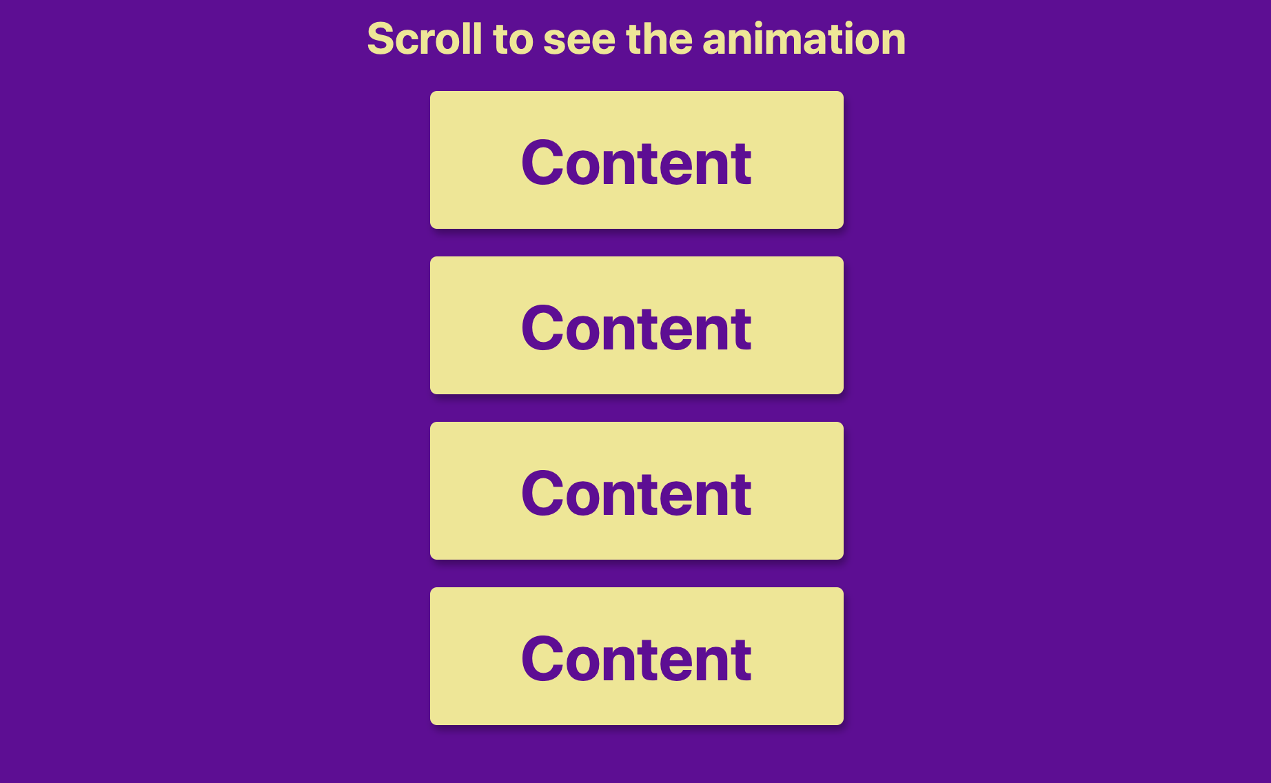
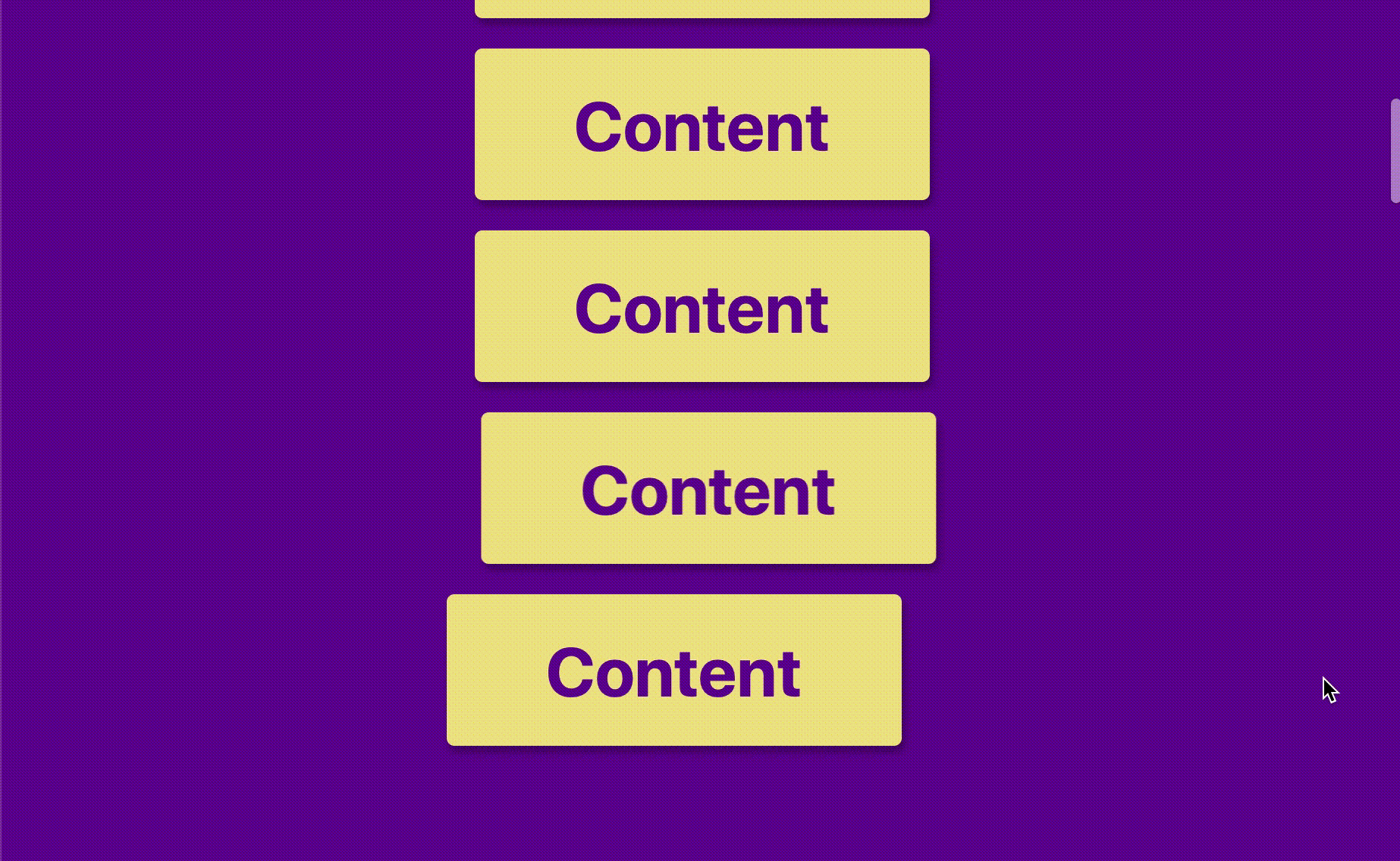
该项目本体展示了一个随着页面下拉, 圆角矩形框体从页面左侧和右侧依次飞入页面中央竖向排列的动画效果.
本项目并不涉及新的知识点.
效果:
2. 结构和切图
网页的基本结构同样很简单, 只包含一个标题和数个 div 容器承载圆角矩形框体.
1
2
3
4
5
6
7
<body>
    <h1>Scroll to see the animation</h1>
    <div class="box"><h2>Content</h2></div>
    <div class="box"><h2>Content</h2></div>
    <div class="box"><h2>Content</h2></div>
    ...
</body>
3. 编写 CSS 样式
首先确保标题文字水平垂直居中:
1
2
3
4
5
6
7
8
9
10
11
12
13
14
15
16
body{

    background-color:#660099;
    display: flex;
    flex-direction: column;
    align-items: center;
    justify-content: center;
    margin: 0;
    overflow-x: hidden;
}

h1{
    color:khaki;
    margin:10px;
    font-family: -apple-system, BlinkMacSystemFont, 'Segoe UI', Roboto, Oxygen, Ubuntu, Cantarell, 'Open Sans', 'Helvetica Neue', sans-serif;
}
其次控制奇数位/偶数位框体的初始样式和处于展示状态的框体样式. 注意此处的用于选择偶数位矩形框体的 CSS 选择器用法.
1
2
3
4
5
6
7
8
9
10
11
12
13
14
15
16
17
18
19
20
21
.box{
    background-color: khaki;
    color: #660099;
    display: flex;
    align-items: center;
    justify-content: center;
    width: 300px;
    height: 100px;
    margin: 10px;
    border-radius: 5px;
    box-shadow: 2px 4px 5px rgba(0, 0, 0, 0.3);
    transform: translateX(400%);
    transition: transform .4s ease;
}

.box:nth-of-type(even){
    transform: translateX(-400%);
}
.box.show {
    transform: translateX(0);
}
最后控制框体内的文字样式.
1
2
3
4
.box h2 {
    font-family: -apple-system, BlinkMacSystemFont, 'Segoe UI', Roboto, Oxygen, Ubuntu, Cantarell, 'Open Sans', 'Helvetica Neue', sans-serif;
    font-size: 45px;
}
完整的 CSS 样式表如下:
1
2
3
4
5
6
7
8
9
10
11
12
13
14
15
16
17
18
19
20
21
22
23
24
25
26
27
28
29
30
31
32
33
34
35
36
37
38
39
40
41
42
43
44
45
46
47
48
<style>
    * {
        box-sizing: border-box;
    }
    body{

        background-color:#660099;
        display: flex;
        flex-direction: column;
        align-items: center;
        justify-content: center;
        margin: 0;
        overflow-x: hidden;
    }

    h1{
        color:khaki;
        margin:10px;
        font-family: -apple-system, BlinkMacSystemFont, 'Segoe UI', Roboto, Oxygen, Ubuntu, Cantarell, 'Open Sans', 'Helvetica Neue', sans-serif;
    }

    .box{
        background-color: khaki;
        color: #660099;
        display: flex;
        align-items: center;
        justify-content: center;
        width: 300px;
        height: 100px;
        margin: 10px;
        border-radius: 5px;
        box-shadow: 2px 4px 5px rgba(0, 0, 0, 0.3);
        transform: translateX(400%);
        transition: transform .4s ease;
    }

    .box:nth-of-type(even){
        transform: translateX(-400%);
    }
    .box.show {
        transform: translateX(0);
    }
    .box h2 {
        font-family: -apple-system, BlinkMacSystemFont, 'Segoe UI', Roboto, Oxygen, Ubuntu, Cantarell, 'Open Sans', 'Helvetica Neue', sans-serif;
        font-size: 45px;
    }

</style>
4. JavaScript
我们编写 JavaScript 设定动画触发位置和框体的 className 更新函数:
1
2
3
4
5
6
7
8
9
10
11
12
13
14
15
16
17
18
19
20
21
22
23
24
25
26
// select all boxes
const boxes = document.querySelectorAll('.box')

// assign the scrolling event to the funtion which is
// responsible for handling the visibility of each boxes
window.addEventListener('scroll', checkBoxes)

// call the function first to initialize the visible boxes
checkBoxes()

function checkBoxes() {
    // set the trigger
    const triggerBottom = window.innerHeight / 5 * 4

    // set whether the box is visible depend on its location
    boxes.forEach(box => {
        const boxTop = box.getBoundingClientRect().top
        // set the box to be visible only if
        // it is above the trigger line
        if(boxTop < triggerBottom) {
            box.classList.add('show')
        } else {
            box.classList.remove('show')
        }
    })
}
最后, 完整的网页演示可见 此处