二分式展示主页 Split-Landing-Page
1. 概述
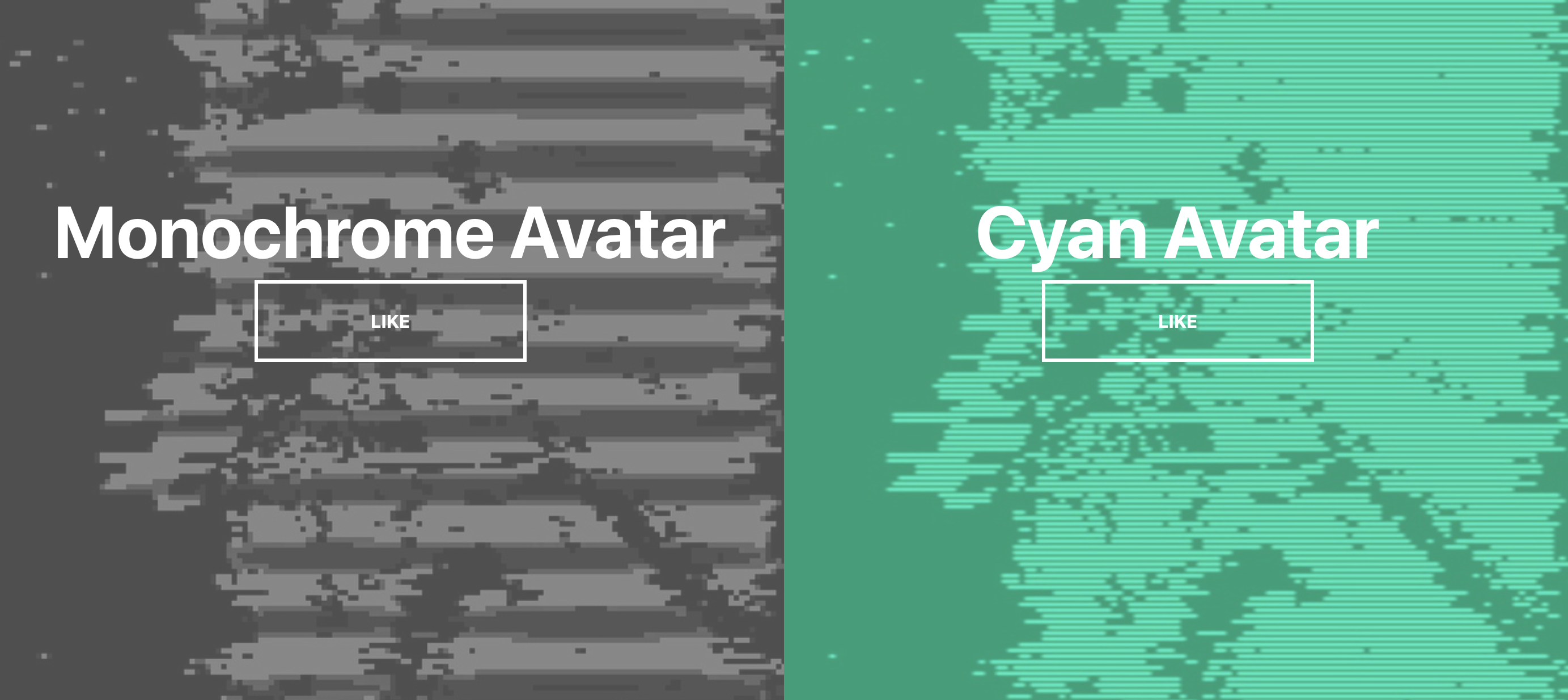
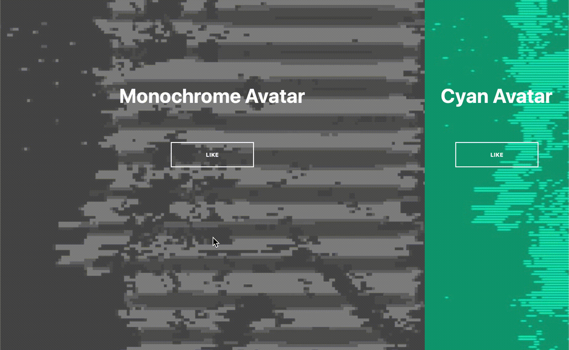
该项目本体为一个二分式展示主页, 光标移动到任意一侧内时那一侧宽度会被扩张到全屏宽度的 $75\%$, 伴随字体和背景图片的平滑放大动画.
本项目中将涉及如下知识点:
CSS变量的大量使用CSS的before伪类的使用- 对光标移入和移出元素事件的监听
效果:
2. 结构和切图
网页的基本结构:
1
2
3
4
5
6
7
8
9
10
11
12
<body>
    <div class="container">
        <div class="split left">
            <h1>Monochrome Avatar</h1>
            <a href="#" class="btn"> Like</a>
        </div>
        <div class="split right">
            <h1>Cyan Avatar</h1>
            <a href="#" class="btn"> Like</a>
        </div>
    </div>
</body>
两侧的展示内容分别被包裹在一个 div 容器内, 二者同被包裹在一个更大的容器里. 按钮和描述文字定位方式为绝对定位.
3. 编写 CSS 样式
首先规定如下的 CSS 变量便于取用:
1
2
3
4
5
6
7
8
9
:root{
    --left-bg-color: rgba(112, 112, 112, 0.7);
    --right-bg-color: rgba(0, 226, 169, 0.7);
    --left-btn-hover-color: rgba(112, 112, 112, 0.7);
    --right-btn-hover-color: rgba(0, 226, 169, 0.7);
    --hover-width: 75%;
    --other-width: 25%;
    --speed: 800ms;
}
可见我们定义了两侧的背景颜色, 按钮颜色, 着重展示时的宽度和动画时间.
我们其次定义文字和按钮样式:
1
2
3
4
5
6
7
8
9
10
11
12
13
14
15
16
17
18
19
20
21
22
23
24
25
26
27
28
29
30
31
32
body {
    font-family: -apple-system, BlinkMacSystemFont, 'Segoe UI', Roboto, Oxygen, Ubuntu, Cantarell, 'Open Sans', 'Helvetica Neue', sans-serif;
    height: 10vh;
    overflow: hidden;
    margin: 0;
}
h1 {
    font-size: 4rem;
    color: #fff;
    position: absolute;
    left: 50%;
    top: 20%;
    transform: translateX(-50%);
    white-space: nowrap;
}
.btn{
    position: absolute;
    display: flex;
    align-items: center;
    justify-content: center;
    left: 50%;
    top: 40%;
    transform: translateX(-50%);
    text-decoration: none;
    color: #fff;
    border: #fff solid 0.2rem;
    font-size: 1rem;
    font-weight: bold;
    text-transform: uppercase;
    width: 15rem;
    padding: 1.5rem;
}
我们再定义按钮悬浮时的变色效果:
1
2
3
4
5
6
7
8
9
.split.left .btn:hover {
    background-color: var(--left-btn-hover-color);
    border-color: var(--left-btn-hover-color);
}

.split.right .btn:hover {
    background-color: var(--right-btn-hover-color);
    border-color: var(--right-btn-hover-color);
}
其次控制容器样式和左侧/右侧子容器的样式.
1
2
3
4
5
6
7
8
9
10
11
12
13
14
15
16
17
18
19
20
21
22
23
24
25
26
27
28
29
30
31
32
33
34
35
36
37
38
39
40
41
.container {
    position: relative;
    width: 100vw;
    height: 100vh;
    background: #333;
}

.split {
    position: absolute;
    width: 50%;
    height: 100vh;
    overflow: hidden;
}
.split.left{
    left: 0;
    background: url('../expanding-cards/avatar0.jpg');
    background-repeat: no-repeat;
    background-size: cover;
}
.split.left::before{
    content: '';
    position: absolute;
    width: 100%;
    height: 100%;
    background-color: var(--left-bg-color);
}

.split.right {
    right: 0;
    background: url('../expanding-cards/avatar3.jpg');
    background-repeat: no-repeat;
    background-size: cover;
}

.split.right::before {
    content: '';
    position: absolute;
    width: 100%;
    height: 100%;
    background-color: var(--right-bg-color);
}
此处注意我们使用了 before 伪类实现了半透明的背景图片遮罩.
最后定义光标在不同展示侧悬浮时, 左右两侧所应占据空间的水平宽度.
注意对于左侧和右侧而言, 其得到着重强调时所需要占据的宽度均为 var(--hover-width).
1
2
3
4
5
6
7
8
9
10
11
12
13
14
15
16
17
18
19
20
.split.right, .split.left,
.split.right::before, .split.left::before {
    transition: all var(--speed) ease-in-out;
}

.hover-left .left {
    width: var(--hover-width);
}

.hover-left .right {
    width: var(--other-width);
}

.hover-right .left {
    width: var(--other-width);
}

.hover-right .right {
    width: var(--hover-width);
}
完整的 CSS 样式表如下:
1
2
3
4
5
6
7
8
9
10
11
12
13
14
15
16
17
18
19
20
21
22
23
24
25
26
27
28
29
30
31
32
33
34
35
36
37
38
39
40
41
42
43
44
45
46
47
48
49
50
51
52
53
54
55
56
57
58
59
60
61
62
63
64
65
66
67
68
69
70
71
72
73
74
75
76
77
78
79
80
81
82
83
84
85
86
87
88
89
90
91
92
93
94
95
96
97
98
99
100
101
102
103
104
105
106
107
108
109
110
111
112
113
114
115
116
117
118
119
120
121
122
123
124
125
126
127
128
129
130
131
132
133
<style>
    :root{
        --left-bg-color: rgba(112, 112, 112, 0.7);
        --right-bg-color: rgba(0, 226, 169, 0.7);
        --left-btn-hover-color: rgba(112, 112, 112, 0.7);
        --right-btn-hover-color: rgba(0, 226, 169, 0.7);
        --hover-width: 75%;
        --other-width: 25%;
        --speed: 800ms;
    }
    * {
        box-sizing: border-box;
    }

    body {
        font-family: -apple-system, BlinkMacSystemFont, 'Segoe UI', Roboto, Oxygen, Ubuntu, Cantarell, 'Open Sans', 'Helvetica Neue', sans-serif;
        height: 10vh;
        overflow: hidden;
        margin: 0;
    }
    h1 {
        font-size: 4rem;
        color: #fff;
        position: absolute;
        left: 50%;
        top: 20%;
        transform: translateX(-50%);
        white-space: nowrap;
    }
    .btn{
        position: absolute;
        display: flex;
        align-items: center;
        justify-content: center;
        left: 50%;
        top: 40%;
        transform: translateX(-50%);
        text-decoration: none;
        color: #fff;
        border: #fff solid 0.2rem;
        font-size: 1rem;
        font-weight: bold;
        text-transform: uppercase;
        width: 15rem;
        padding: 1.5rem;
    }

    .split.left .btn:hover {
        background-color: var(--left-btn-hover-color);
        border-color: var(--left-btn-hover-color);
    }

    .split.right .btn:hover {
        background-color: var(--right-btn-hover-color);
        border-color: var(--right-btn-hover-color);
    }

    .container {
        position: relative;
        width: 100vw;
        height: 100vh;
        background: #333;
    }

    .split {
        position: absolute;
        width: 50%;
        height: 100vh;
        overflow: hidden;
    }
    .split.left{
        left: 0;
        background: url('../expanding-cards/avatar0.jpg');
        background-repeat: no-repeat;
        background-size: cover;
    }
    .split.left::before{
        content: '';
        position: absolute;
        width: 100%;
        height: 100%;
        background-color: var(--left-bg-color);
    }

    .split.right {
        right: 0;
        background: url('../expanding-cards/avatar3.jpg');
        background-repeat: no-repeat;
        background-size: cover;
    }

    .split.right::before {
        content: '';
        position: absolute;
        width: 100%;
        height: 100%;
        background-color: var(--right-bg-color);
    }

    .split.right, .split.left,
    .split.right::before, .split.left::before {
        transition: all var(--speed) ease-in-out;
    }

    .hover-left .left {
        width: var(--hover-width);
    }

    .hover-left .right {
        width: var(--other-width);
    }

    .hover-right .left {
        width: var(--other-width);
    }

    .hover-right .right {
        width: var(--hover-width);
    }

    @media (max-width: 800px) {
        h1 {
            font-size: 2rem;
            top: 30%;
        }

        .btn {
            padding: 1.2rem;
            width: 12rem;
        }
    }

</style>
4. JavaScript
最后编写 JavaScript 监听光标在左右两侧的浮入/浮出事件并以此为依据调整展示侧的水平宽度达成强调效果.
1
2
3
4
5
6
7
8
9
10
11
const left = document.querySelector('.left');
const right = document.querySelector('.right');
const container = document.querySelector('.container');

// handle left side's mouse enter and leave event
left.addEventListener('mouseenter', () => container.classList.add('hover-left'))
left.addEventListener('mouseleave', () => container.classList.remove('hover-left'))

// handle right side's mouse enter and leave event
right.addEventListener('mouseenter', () => container.classList.add('hover-right'))
right.addEventListener('mouseleave', () => container.classList.remove('hover-right'))
最后, 完整的网页演示可见 此处