仿 Material Design 按键 Button-Ripple-Effect
1. 概述
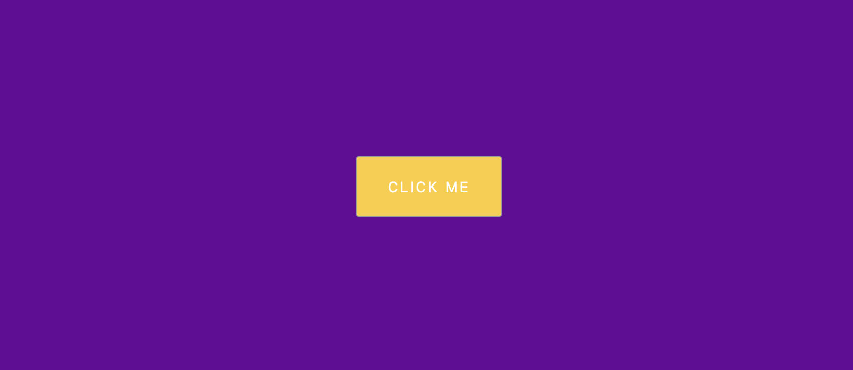
项目本体模拟了 Material Design 按键的按动效果.
本项目中涉及的知识点:
- 了解
JavaScript事件对象的属性 - 使用
setTimeout()在指定的时间后调用函数或计算表达式 - 使用
letter-spacing属性控制字符间距 - 使用
translate(-50%, -50%)将元素置于其定位点的中心位置 - 使用
scale()对元素大小进行缩放 - 使用
@keyframes规则创建补间动画
效果:

2. 结构和切图
网页的基本结构如下:
1
2
3
<body>
    <button class="ripple">Click Me</button>
</body>
3. 编写 CSS 样式
首先定义排版模式, 并设定水平垂直居中:
1
2
3
4
5
6
7
8
9
10
11
body {
    background-color: #660099;
    font-family: -apple-system, BlinkMacSystemFont, 'Segoe UI', Roboto, Oxygen, Ubuntu, Cantarell, 'Open Sans', 'Helvetica Neue', sans-serif;
    display: flex;
    align-items: center;
    justify-content: center;
    height: 100vh;
    flex-direction: column;
    margin: 0;
    overflow: hidden;
}
其次设定按钮样式:
1
2
3
4
5
6
7
8
9
10
11
12
13
14
15
16
button {
    background-color: #FFCC33;
    color: #fff;
    border: 1px #999999 solid;
    font-size: 14px;
    border-radius: 2px;
    text-transform: uppercase;
    letter-spacing: 2px;
    padding: 20px 30px;
    margin: 10p 0x;
    position: relative;
    overflow: hidden;
}
button:focus {
    outline: none;
}
再调整构成水波纹动效的圆形波纹遮罩的初始样式. 注意遮罩样式初始值为一个圆心在其定位框体 border-box 左上角的白色圆, 大小被缩放为 $0$, 结合 animation 语句可以实现从小到大的波纹扩散效果.
1
2
3
4
5
6
7
8
9
button .circle {
    position: absolute;
    background-color: #fff;
    width: 100px;
    height: 100px;
    border-radius: 50%;
    transform: translate(-50%, -50%) scale(0);
    animation: scale .5s ease-out;
}
最后定义水波纹扩散效果的结束关键帧, 并令浏览器自行计算其间的补间动画.
1
2
3
4
5
6
@keyframes scale {
    to {
        transform: translate(-50%, -50%) scale(3);
        opacity: 0;
    }
}
完整的 CSS 样式表如下:
1
2
3
4
5
6
7
8
9
10
11
12
13
14
15
16
17
18
19
20
21
22
23
24
25
26
27
28
29
30
31
32
33
34
35
36
37
38
39
40
41
42
43
44
45
46
47
* {
   box-sizing: border-box;
}
body {
   background-color: #660099;
   font-family: -apple-system, BlinkMacSystemFont, 'Segoe UI', Roboto, Oxygen, Ubuntu, Cantarell, 'Open Sans', 'Helvetica Neue', sans-serif;
   display: flex;
   align-items: center;
   justify-content: center;
   height: 100vh;
   flex-direction: column;
   margin: 0;
   overflow: hidden;
}
button {
   background-color: #FFCC33;
   color: #fff;
   border: 1px #999999 solid;
   font-size: 14px;
   border-radius: 2px;
   text-transform: uppercase;
   letter-spacing: 2px;
   padding: 20px 30px;
   margin: 10p 0x;
   position: relative;
   overflow: hidden;
}
button:focus {
   outline: none;
}

button .circle {
   position: absolute;
   background-color: #fff;
   width: 100px;
   height: 100px;
   border-radius: 50%;
   transform: translate(-50%, -50%) scale(0);
   animation: scale .5s ease-out;
}

@keyframes scale {
   to {
       transform: translate(-50%, -50%) scale(3);
       opacity: 0;
   }
}
4. JavaScript
最后编写 JavaScript 函数.
1
2
3
4
5
6
7
8
9
10
11
12
13
14
15
16
17
18
19
20
21
22
23
24
const buttons = document.querySelectorAll('.ripple');

buttons.forEach(button => {
    button.addEventListener('click', function (e) {
        const x = e.clientX;
        const y = e.clientY;

        const buttonTop = e.target.offsetTop;
        const buttonLeft = e.target.offsetLeft;

        const xInside = x - buttonLeft;
        const yInside = y - buttonTop;

        const circle = document.createElement('span');
        circle.classList.add('circle');
        circle.style.top = yInside + 'px';
        circle.style.left = xInside + 'px';

        // this ==> button
        this.appendChild(circle);

        setTimeout(() => circle.remove(), 500);
    })
})
在此处我们注意:
一般地, 事件对象 e 具备以下属性:
| Property | Function |
|---|---|
timeStamp |
返回事件生成的日期和时间 |
button |
返回事件触发时所点击的鼠标按钮 |
pageX |
返回光标相对网页的水平位置 |
pageY |
返回光标相对网页的垂直位置 |
screenX |
返回光标相对屏幕的水平位置 |
screenY |
返回光标相对屏幕的垂直位置 |
target |
返回该事件被传送到的对象 |
type |
返回事件类型 |
clientX |
返回光标相对当前可见区域的水平位置 |
clientY |
返回光标相对当前可见区域的垂直位置 |
最后, 完整的网页演示可见 此处