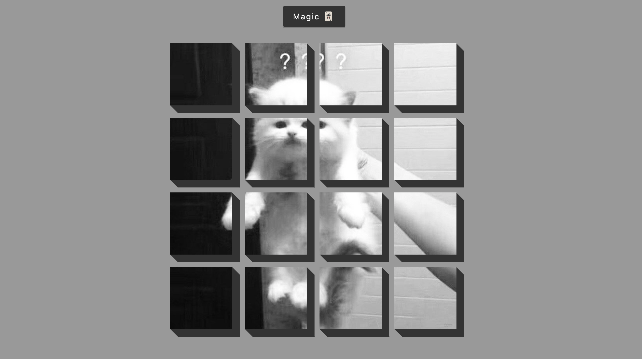
图片一键切分动画 3D-Box-Background
1. 概述
项目本体展现了切分图片的动画效果.
本项目中涉及的知识点:
- 使用
translateY()模拟按钮按下的另一种动画效果 - 使用
space-around排版方式在确保多个对象间距相同的前提下, 最左和最右的对象距离屏幕边缘间距相等而非紧靠屏幕的排版布局 - 使用
skewX和skewY模拟斜向投影效果 - 利用
flex排版方式结合flex-direction实现伪网格布局
效果:

2. 结构和切图
网页的基本结构如下:
1
2
3
4
5
6
<body>

    <button id="btn" class="magic">Magic 🃏</button>
    <div id="boxes" class="boxes big"></div>

</body>
注意实际上每一个正方形的图片切片都是一个单独的 div, 这些容器我们将通过 JavaScript 插入到 boxes 容器中.
3. 编写 CSS 样式
首先将 body 中元素的排版方式设为水平垂直居中:
1
2
3
4
5
6
7
8
9
10
11
body {
    background-color: #999999;
    font-family: -apple-system, BlinkMacSystemFont, 'Segoe UI', Roboto, Oxygen, Ubuntu, Cantarell, 'Open Sans', 'Helvetica Neue', sans-serif;
    display: flex;
    flex-direction: column;
    align-items: center;
    justify-content: center;
    height: 100vh;
    overflow: hidden;
    margin: 0;
}
然后定义切换动画的按钮的样式:
1
2
3
4
5
6
7
8
9
10
11
12
13
14
15
16
.magic {
    background-color: #333;
    color: #ffffff;
    font-family: -apple-system, BlinkMacSystemFont, 'Segoe UI', Roboto, Oxygen, Ubuntu, Cantarell, 'Open Sans', 'Helvetica Neue', sans-serif;
    border: 0;
    border-radius: 3px;
    font-size: 16px;
    padding: 12px 20px;
    cursor: pointer;
    position: fixed;
    top: 20px;
    letter-spacing: 2px;
    box-shadow: 0 3px rgba(99,99,99, 0.5);
    z-index: 114514;
    transition: .3s ease;
}
下面处理按钮按下的效果. 注意此处模拟按钮按下效果是通过控制按钮的位移而非调整按钮本身的尺寸实现的.
1
2
3
4
5
6
7
.magic:focus {
    outline: none;
}
.magic:active {
    box-shadow: none;
    transform: translateY(2px);
}
下面设定容纳每一个图片方块的容器的样式:
1
2
3
4
5
6
7
8
9
.box {
    background-image: url('../expanding-cards/avatar1.JPG');
    background-repeat: no-repeat;
    background-size: 500px 500px;
    position: relative;
    height: 125px;
    width: 125px;
    transition: .4s ease;
}
然后使用 skewX() 和 skewY() 命令, 渲染图片方块下方和右侧的立体侧边.
此处注意相关语法:
我们以元素左上角为原点, 向下竖直衍生出 $y$ 轴, 向右水平衍生出 $x$ 轴. 则有:
skewX(deg): 顺时针旋转直到元素方块 $x$ 轴与其上方边框形成的夹角为 deg 度.
skewY(deg): 逆时针旋转直到元素方块 $y$ 轴与其左侧边框形成的夹角为 deg 度.
1
2
3
4
5
6
7
8
9
10
11
12
13
14
15
16
17
18
19
20
21
.box::after {
    content: '';
    background-color: #333;
    position: absolute;
    top: 8px;
    right: -15px;
    height: 100%;
    width: 15px;
    transform: skewY(45deg);
}

.box::before {
    content: '';
    background-color: #333;
    position: absolute;
    bottom: -15px;
    left: 8px;
    height: 15px;
    width: 100%;
    transform: skewX(45deg);
}
定义容纳所有图片方块的大容器 boxes 在动画变换前后的样式:
1
2
3
4
5
6
7
8
9
10
11
12
13
.boxes {
    display: flex;
    flex-wrap: wrap;
    justify-content: space-around;
    height: 500px;
    width: 500px;
    position: relative;
    transition: .4s ease;
}
.boxes.big {
    width: 600px;
    height: 600px;
}
最后定义动画效果触发时图片方块的样式. 我们规定动画出发时每一个图片方块的动画效果都是顺时针旋转 $360$ 度. 注意此处 CSS 选择器的用法.
1
2
3
.boxes.big .box {
    transform: rotateZ(360deg);
}
完整的 CSS 样式表如下. 为了更好的体验, 我们还设定了允许图片容器显示的最小屏幕宽度和高度.
1
2
3
4
5
6
7
8
9
10
11
12
13
14
15
16
17
18
19
20
21
22
23
24
25
26
27
28
29
30
31
32
33
34
35
36
37
38
39
40
41
42
43
44
45
46
47
48
49
50
51
52
53
54
55
56
57
58
59
60
61
62
63
64
65
66
67
68
69
70
71
72
73
74
75
76
77
78
79
80
81
82
83
84
85
86
87
88
89
90
91
92
93
94
95
96
97
98
99
100
101
 * {
    box-sizing: border-box;
}

body {
    background-color: #999999;
    font-family: -apple-system, BlinkMacSystemFont, 'Segoe UI', Roboto, Oxygen, Ubuntu, Cantarell, 'Open Sans', 'Helvetica Neue', sans-serif;
    display: flex;
    flex-direction: column;
    align-items: center;
    justify-content: center;
    height: 100vh;
    overflow: hidden;
    margin: 0;
}

.magic {
    background-color: #333;
    color: #ffffff;
    font-family: -apple-system, BlinkMacSystemFont, 'Segoe UI', Roboto, Oxygen, Ubuntu, Cantarell, 'Open Sans', 'Helvetica Neue', sans-serif;
    border: 0;
    border-radius: 3px;
    font-size: 16px;
    padding: 12px 20px;
    cursor: pointer;
    position: fixed;
    top: 20px;
    letter-spacing: 2px;
    box-shadow: 0 3px rgba(99,99,99, 0.5);
    z-index: 114514;
    transition: .3s ease;
}

.magic:focus {
    outline: none;
}
.magic:active {
    box-shadow: none;
    transform: translateY(2px);
}

.boxes {
    display: flex;
    flex-wrap: wrap;
    justify-content: space-around;
    height: 500px;
    width: 500px;
    position: relative;
    transition: .4s ease;
}
.boxes.big {
    width: 600px;
    height: 600px;
}
.boxes.big .box {
    transform: rotateZ(360deg);
}

.box {
    background-image: url('../expanding-cards/avatar1.JPG');
    background-repeat: no-repeat;
    background-size: 500px 500px;
    position: relative;
    height: 125px;
    width: 125px;
    transition: .4s ease;
}

.box::after {
    content: '';
    background-color: #333;
    position: absolute;
    top: 8px;
    right: -15px;
    height: 100%;
    width: 15px;
    transform: skewY(45deg);
}

.box::before {
    content: '';
    background-color: #333;
    position: absolute;
    bottom: -15px;
    left: 8px;
    height: 15px;
    width: 100%;
    transform: skewX(45deg);
}

@media (max-height: 790px) {
    .box {
        display: none;
    }
}

@media (max-width: 650px) {
    .box {
        display: none;
    }
}
4. JavaScript
最后编写 JavaScript 函数:
1
2
3
4
5
6
7
8
9
10
11
12
13
14
15
16
17
const boxesContainer = document.getElementById('boxes');
const btn = document.getElementById('btn');

btn.addEventListener('click', () => boxesContainer.classList.toggle('big'))

function createBoxes() {
    for (let i=0; i<4; i++) {
        for (let j=0; j<4; j++) {
            const box = document.createElement('div');
            box.classList.add('box');
            box.style.backgroundPosition = `${-j * 125}px ${-i * 125}px`;
            boxesContainer.appendChild(box);
        }
    }
}

createBoxes()
最后, 完整的网页演示可见 此处