
移动端底栏导航 Mobile Tab Navigation
1. 概述
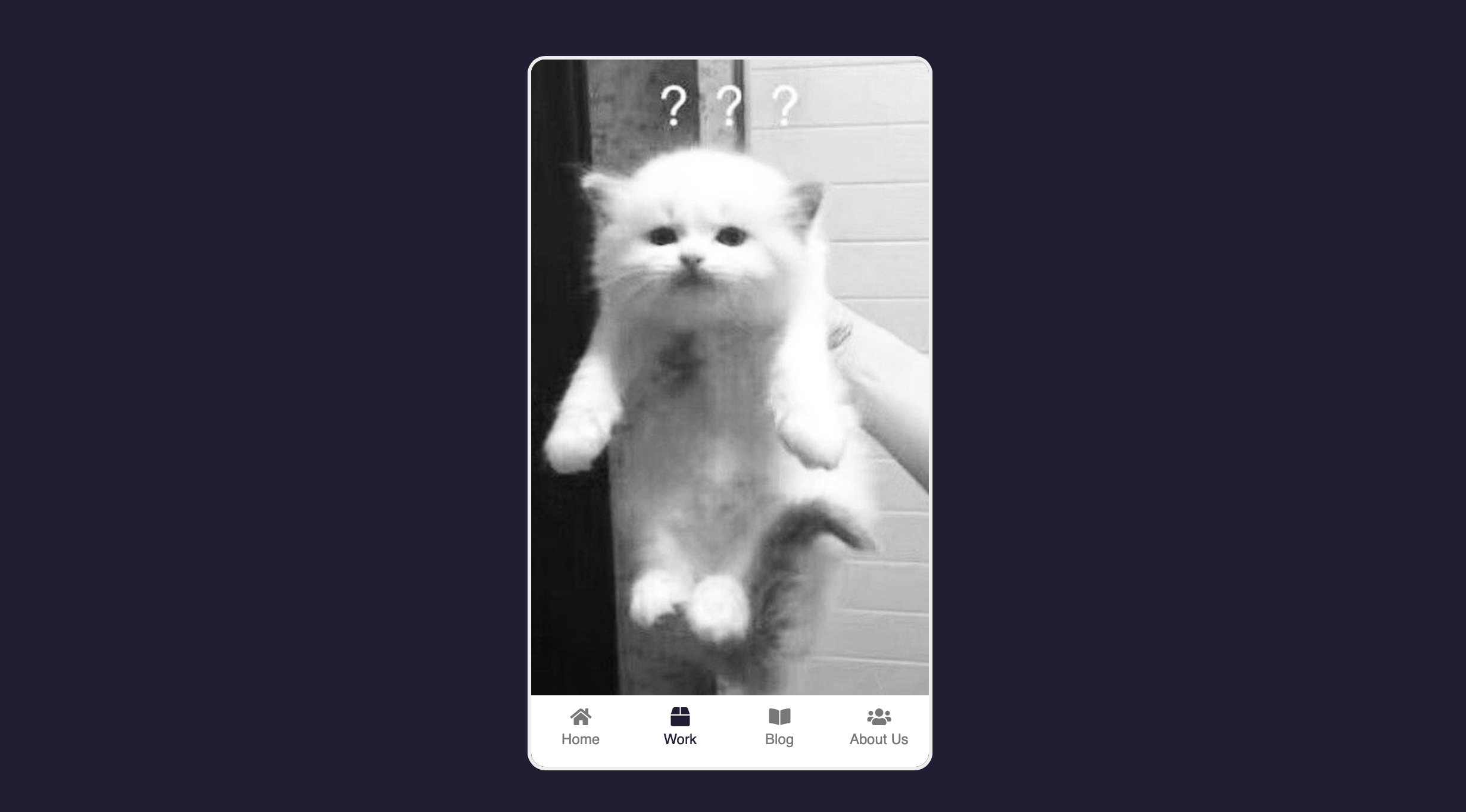
项目展示了一个移动端底栏导航组件.
效果:
2. 结构和切图
网页的基本结构如下:
1
2
3
4
5
6
7
8
9
10
11
12
13
14
15
16
17
18
19
20
21
22
23
24
25
26
27
28
29
<body>
    <div class="phone">
        <img src= "../expanding-cards/avatar0.JPG" alt="home" class="content show"/>
        <img src= "../expanding-cards/avatar1.JPG" alt="work" class="content"/>
        <img src= "../expanding-cards/avatar2.JPG" alt="blog" clsas="content"/>
        <img src= "../expanding-cards/avatar3.JPG" alt="about" class="content"/>

        <nav>
            <ul>
                <li class="active">
                    <i class="fas fa-home"></i>
                    <p>Home</p>
                </li>
                <li>
                    <i class="fas fa-box"></i>
                    <p>Work</p>
                </li>
                <li>
                    <i class="fas fa-book-open"></i>
                    <p>Blog</p>
                </li>
                <li>
                    <i class="fas fa-users"></i>
                    <p>About Us</p>
                </li>
            </ul>
        </nav>
    </div>
</body>
3. 编写 CSS 样式
完整的 CSS 样式表如下:
1
2
3
4
5
6
7
8
9
10
11
12
13
14
15
16
17
18
19
20
21
22
23
24
25
26
27
28
29
30
31
32
33
34
35
36
37
38
39
40
41
42
43
44
45
46
47
48
49
50
51
52
53
54
55
56
57
58
59
60
61
62
63
64
65
66
* {
    box-sizing: border-box;
}

body {
    background-color: #1f1e33;
    font-family: 'Open Sans', sans-serif;
    display: flex;
    align-items: center;
    justify-content: center;
    height: 100vh;
    margin: 0;
}

.phone {
    position: relative;
    overflow: hidden;
    border: 3px solid #eee;
    border-radius: 15px;
    height: 600px;
    width: 340px;
}
.phone .content {
    opacity: 0;
    object-fit: cover;
    position: absolute;
    top: 0;
    left: 0;
    height: calc(100% - 60px);
    width: 100%;
    transition: opacity 0.4s ease;
}
.phone .content.show {
    opacity: 1;
}

nav {
    position: absolute;
    bottom: 0;
    left: 0;
    margin-top: -5px;
    width: 100%;
}
nav ul {
    background-color: #fff;
    display: flex;
    list-style-type: none;
    padding: 0;
    margin: 0;
    height: 60px;
}
nav li {
    color: #777;
    cursor: pointer;
    flex: 1;
    padding: 10px;
    text-align: center;
}
nav ul li p {
    font-size: 12px;
    margin: 2px 0;
}
nav ul li:hover,
nav ul li.active {
    color: #1f1e33;
}
4. JavaScript
最后, 我们编写 JavaScript 函数:
1
2
3
4
5
6
7
8
9
10
11
12
13
14
15
16
17
18
19
const contents = document.querySelectorAll('.content');
const listItems = document.querySelectorAll('nav ul li');

listItems.forEach((item, idx) => {
    item.addEventListener('click', () => {
        hideAllContents();
        hideAllItems();
        item.classList.add('active');
        contents[idx].classList.add('show');
    })
})

function hideAllContents() {
    contents.forEach(content => content.classList.remove('show'));
}

function hideAllItems() {
    listItems.forEach(item => item.classList.remove('active'));
}
最后, 完整的网页演示可见 此处