
内容占位容器 Content Placeholder
1. 概述
项目本体展示了一个用于在数据加载时占位的容器.
本项目中涉及的知识点:
html中有时使用 作为空格.- 通过使用
JavaScript控制className和删除DOM元素实现实际内容的显示/隐藏和加载动画的删除 - 使用
infinite属性控制动画无限播放
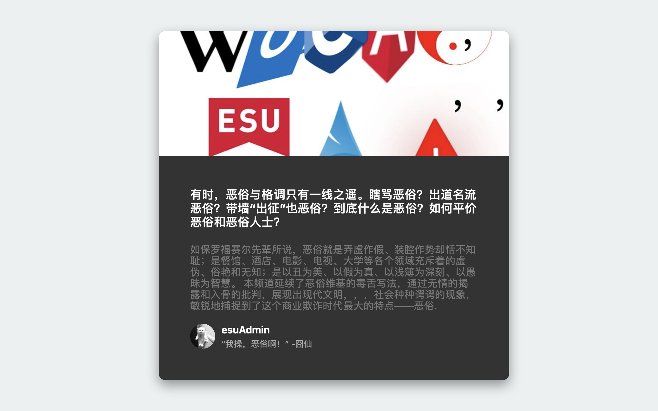
效果:
2. 结构和切图
网页的基本结构如下:
1
2
3
4
5
6
7
8
9
10
11
12
13
14
15
16
17
18
19
20
21
22
23
24
<body>
<div class="card">
<div class="card-header animated-bg" id="header" draggable="false"> </div>
<div class="card-content">
<h3 class="card-title animated-bg animated-bg-text" id="title"> </h3>
<p class="card-excerpt" id="excerpt">
<span class="animated-bg animated-bg-text"> </span>
<span class="animated-bg animated-bg-text"> </span>
<span class="animated-bg animated-bg-text"> </span>
<span class="animated-bg animated-bg-text"> </span>
<span class="animated-bg animated-bg-text"> </span>
<span class="animated-bg animated-bg-text"> </span>
</p>
<div class="author">
<div class="profile-img animated-bg" id="profile_img"> </div>
<div class="author-info">
<strong class="animated-bg animated-bg-text" id="name"> </strong>
<small class="animated-bg animated-bg-text" id="date"> </small>
</div>
</div>
</div>
</div>
</body>
我们创建数个 animated-bg animated-bg-text 占位容器用于在内容加载时表示标题, 预览, 作者名和作者简介. 这些占位容器最终都会被 getData() 函数删除或者替换.
3. 编写 CSS 样式
首先将 body 的样式设为 水平垂直居中:
1
2
3
4
5
6
7
8
9
10
11
12
body {
            background-color: #ecf0f1;
            font-family: -apple-system, BlinkMacSystemFont, 'Segoe UI', Roboto, Oxygen, Ubuntu, Cantarell, 'Open Sans', 'Helvetica Neue', sans-serif;
            display: flex;
            align-items: center;
            justify-content: center;
            height: 100vh;
            overflow: hidden;
            margin: 0;
            user-select: none;
            -webkit-user-select: none;
        }
然后分别设定 Card 及其内各级文字内容的样式:
1
2
3
4
5
6
7
8
9
10
11
12
13
14
15
16
17
18
19
20
21
22
23
24
25
26
27
28
29
30
31
32
33
34
35
36
37
38
39
40
41
42
43
44
45
46
47
48
49
50
51
52
53
54
.card {
    box-shadow: 0 8px 20px rgba(0, 0, 0, 0.4);
    border-radius: 10px;
    overflow: hidden;
    width: 560px;
    background-color: #333;
}
.card-header{
    height: 200px;
    margin-bottom: 10px
}
.card-header img {
    object-fit: cover;
    height: 100%;
    width: 100%;
}
.card-content {
    background-color: #333;
    padding: 30px;
    margin: 20px;
}
.card-title {
    height: 80px;
    margin: 0;
    color: #fff;
}
.card-excerpt {
    color: #777;
    margin: 10px 0px 20px;
}
.author {
    display: flex;

}
.profile-img {
    border-radius: 50%;
    overflow: hidden;
    height: 40px;
    width: 40px;
}
.author-info {
    display: flex;
    flex-direction: column;
    justify-content: space-around;
    margin-left: 10px;
    width: 200px;
}
.author-info strong {
    color: #fff;
}
.author-info small {
    color: #aaa;
    margin-top: 5px;
}
下面设定加载动画. 加载动画的本质是一个经过补帧的, 不断平移的渐变背景.
1
2
3
4
5
6
7
8
9
10
11
12
13
14
15
16
17
18
19
20
21
22
23
24
25
26
27
.animated-bg {
    background-image: linear-gradient(
        to right,
        #f6f7f8 0%,
        #edeef1 10%,
        #f6f7f8 20%,
        #f6f7f8 100%
    );
    background-size: 200% 100%;
    animation: bgPos 1s linear infinite;
}
.animated-bg-text {
    border-radius: 50px;
    display: inline-block;
    margin: 0;
    height: 10px;
    width: 100%;
}

@keyframes bgPos {
    0% {
        background-position: 50% 0;
    }
    100% {
        background-position: -150% 0;
    }
}
完整的 CSS 样式表如下:
1
2
3
4
5
6
7
8
9
10
11
12
13
14
15
16
17
18
19
20
21
22
23
24
25
26
27
28
29
30
31
32
33
34
35
36
37
38
39
40
41
42
43
44
45
46
47
48
49
50
51
52
53
54
55
56
57
58
59
60
61
62
63
64
65
66
67
68
69
70
71
72
73
74
75
76
77
78
79
80
81
82
83
84
85
86
87
88
89
90
91
92
93
94
95
96
97
98
99
100
101
102
* {
   box-sizing: border-box;
}
body {
   background-color: #ecf0f1;
   font-family: -apple-system, BlinkMacSystemFont, 'Segoe UI', Roboto, Oxygen, Ubuntu, Cantarell, 'Open Sans', 'Helvetica Neue', sans-serif;
   display: flex;
   align-items: center;
   justify-content: center;
   height: 100vh;
   overflow: hidden;
   margin: 0;
   user-select: none;
   -webkit-user-select: none;
}

img {
   max-width: 100%;
}

.card {
   box-shadow: 0 8px 20px rgba(0, 0, 0, 0.4);
   border-radius: 10px;
   overflow: hidden;
   width: 560px;
   background-color: #333;
}
.card-header{
   height: 200px;
   margin-bottom: 10px
}
.card-header img {
   object-fit: cover;
   height: 100%;
   width: 100%;
}
.card-content {
   background-color: #333;
   padding: 30px;
   margin: 20px;
}
.card-title {
   height: 80px;
   margin: 0;
   color: #fff;
}
.card-excerpt {
   color: #777;
   margin: 10px 0px 20px;
}
.author {
   display: flex;

}
.profile-img {
   border-radius: 50%;
   overflow: hidden;
   height: 40px;
   width: 40px;
}
.author-info {
   display: flex;
   flex-direction: column;
   justify-content: space-around;
   margin-left: 10px;
   width: 200px;
}
.author-info strong {
   color: #fff;
}
.author-info small {
   color: #aaa;
   margin-top: 5px;
}

.animated-bg {
   background-image: linear-gradient(
       to right,
       #f6f7f8 0%,
       #edeef1 10%,
       #f6f7f8 20%,
       #f6f7f8 100%
   );
   background-size: 200% 100%;
   animation: bgPos 1s linear infinite;
}
.animated-bg-text {
   border-radius: 50px;
   display: inline-block;
   margin: 0;
   height: 10px;
   width: 100%;
}

@keyframes bgPos {
   0% {
       background-position: 50% 0;
   }
   100% {
       background-position: -150% 0;
   }
}
4. JavaScript
最后编写 JavaScript 函数:
1
2
3
4
5
6
7
8
9
10
11
12
13
14
15
16
17
18
19
20
21
22
23
24
25
const header = document.getElementById('header');
const title = document.getElementById('title');
const excerpt = document.getElementById('excerpt');
const profile_img = document.getElementById('profile_img');
const name = document.getElementById('name');
const date = document.getElementById('date');
const animated_bgs = document.querySelectorAll('.animated-bg');
const animated_bg_texts = document.querySelectorAll('.animated-bg-text');

// simulate data fetching
setTimeout(getData, 2500);

// responsbile for fetcing data
function getData() {
    header.innerHTML = `<img src="./esuA.jpg" alt="" />`;
    title.innerHTML = `有时,恶俗与格调只有一线之遥。瞎骂恶俗?出道名流恶俗?带墙“出征”也恶俗?到底什么是恶俗?如何平价恶俗和恶俗人士?`
    excerpt.innerHTML = `如保罗福赛尔先辈所说,恶俗就是弄虚作假、装腔作势却恬不知耻;是餐馆、酒店、电影、电视、大学等各个领域充斥着的虚伪、俗艳和无知;是以丑为美、以假为真、以浅薄为深刻、以愚昧为智慧。
                        本频道延续了恶俗维基的毒舌写法,通过无情的揭露和入骨的批判,展现出现代文明,,,社会种种谔谔的现象,敏锐地捕捉到了这个商业欺诈时代最大的特点——恶俗.`
    profile_img.innerHTML = `<img src="../expanding-cards/avatar1.JPG" alt="" />`;
    name.innerHTML = `esuAdmin`;
    date.innerHTML = `“我操,恶俗啊!” -囧仙`;

    animated_bgs.forEach((bg) => bg.classList.remove('animated-bg'));
    animated_bgs.forEach((bg) => bg.classList.remove('animated-bg-text'));
}
最后, 完整的网页演示可见 此处