导航栏折叠动画 Animated Navigation
1. 概述
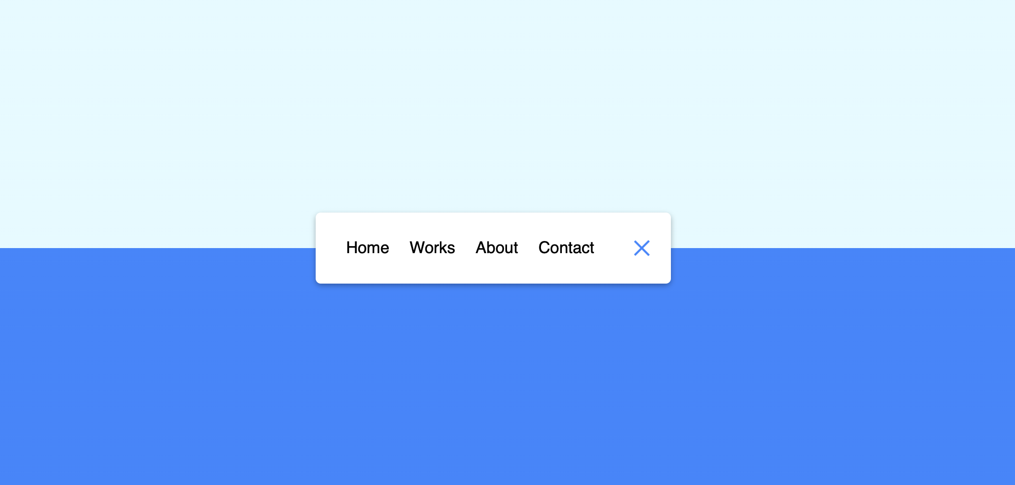
项目本体展示了一个可以一键折叠的导航栏, 且附有导航栏折叠动画.
涉及知识点:
- 使用
linear-gradient()实现背景分割式色块. - 使用
rotateY()和rotateX()实现折叠时文字的水平翻转动画和按钮形状的变换动画
效果:

2. 结构和切图
网页的基本结构如下:
1
2
3
4
5
6
7
8
9
10
11
12
13
14
<body>
    <nav class="active" id="nav">
        <ul>
            <li><a href='#'>Home</a></li>
            <li><a href='#'>Works</a></li>
            <li><a href='#'>About</a></li>
            <li><a href='#'>Contact</a></li>
        </ul>
        <button class="icon" id="toggle">
            <div class="line line1"></div>
            <div class="line line2"></div>
        </button>
    </nav>
</body>
导航栏容器内包含了两个子部分: 容纳跳转网页的无序列表部分和控制导航栏折叠/展开的按钮部分.
3. 编写 CSS 样式
首先设定背景样式和 body 排版模式:
1
2
3
4
5
6
7
8
9
10
11
12
13
14
15
16
body {
    background-color: #eafbff;
    background-image: linear-gradient(
        to bottom,
        #eafbff 0%,
        #eafbff 50%,
        #5290f9 50%,
        #5290f9 100%
    );
    font-family: 'Muli', sans-serif;
    display: flex;
    align-items: center;
    justify-content: center;
    height: 100vh;
    margin: 0;
}
然后设定导航栏展开和折叠时的样式:
1
2
3
4
5
6
7
8
9
10
11
12
13
14
15
nav {
    background-color: #fff;
    padding: 20px;
    width: 80px;
    display: flex;
    align-items: center;
    justify-content: center;
    border-radius: 5px;
    box-shadow: 0 2px 5px rgba(0, 0, 0, 0.3);
    overflow-x: hidden;
    transition: width .6s linear;
}
nav.active {
    width: 350px;
}
再设定导航栏网页链接部分无序列表, 有序列表分别在激活 (导航栏展开) 和未激活 (导航栏折叠) 时的样式:
1
2
3
4
5
6
7
8
9
10
11
12
13
14
15
16
17
18
19
20
21
22
23
24
25
26
27
nav ul {
    display: flex;
    list-style-type: none;
    padding: 0;
    margin: 0;
    width: 0;
    transition: width .6s linear;
}
nav.active ul {
    width: 100%;
}
nav ul li {
    transform: rotateY(0deg);
    opacity: 0;
    transition: transform .6s linear, opacity 0.6s linear;
}

nav.active ul li {
    opacity: 1;
    transform: rotateY(360deg);
}
nav ul a {
    position: relative;
    color: #000;
    text-decoration: none;
    margin: 0 10px;
}
然后来处理按钮部分. 在这里我们 override 了按钮所有的原生样式, 并将其视为一个容器容纳了两条线. 这两条线将在导航栏折叠式平行排布表示 “点击打开折叠列表”, 在导航栏展开后交叉排布表示 “点击将导航栏折叠”.
1
2
3
4
5
6
7
8
9
10
11
12
13
14
15
16
17
18
19
20
21
22
23
24
25
26
27
28
29
30
31
32
33
.icon {
    background-color: #fff;
    border: 0;
    cursor: pointer;
    padding: 0;
    position: relative;
    height: 30px;
    width: 30px;
}
.icon:focus {
    outline: 0;
}
.icon .line {
    background-color: #5290f9;
    height: 2px;
    width: 20px;
    position: absolute;
    top: 10px;
    left: 5px;
    transition: transform .6s linear;
}
.icon .line2 {
    top: auto;
    bottom: 10px;
}

nav.active .icon .line1 {
    transform: rotate(-765deg) translateY(5.5px);
}

nav.active .icon .line2 {
    transform: rotate(765deg) translateY(-5.5px);
}
完整的 CSS 样式表如下:
1
2
3
4
5
6
7
8
9
10
11
12
13
14
15
16
17
18
19
20
21
22
23
24
25
26
27
28
29
30
31
32
33
34
35
36
37
38
39
40
41
42
43
44
45
46
47
48
49
50
51
52
53
54
55
56
57
58
59
60
61
62
63
64
65
66
67
68
69
70
71
72
73
74
75
76
77
78
79
80
81
82
83
84
85
86
87
88
89
90
91
92
93
94
95
* {
    box-sizing: border-box;
}
body {
    background-color: #eafbff;
    background-image: linear-gradient(
        to bottom,
        #eafbff 0%,
        #eafbff 50%,
        #5290f9 50%,
        #5290f9 100%
    );
    font-family: 'Muli', sans-serif;
    display: flex;
    align-items: center;
    justify-content: center;
    height: 100vh;
    margin: 0;
}
nav {
    background-color: #fff;
    padding: 20px;
    width: 80px;
    display: flex;
    align-items: center;
    justify-content: center;
    border-radius: 5px;
    box-shadow: 0 2px 5px rgba(0, 0, 0, 0.3);
    overflow-x: hidden;
    transition: width .6s linear;
}
nav.active {
    width: 350px;
}
nav ul {
    display: flex;
    list-style-type: none;
    padding: 0;
    margin: 0;
    width: 0;
    transition: width .6s linear;
}
nav.active ul {
    width: 100%;
}
nav ul li {
    transform: rotateY(0deg);
    opacity: 0;
    transition: transform .6s linear, opacity 0.6s linear;
}

nav.active ul li {
    opacity: 1;
    transform: rotateY(360deg);
}
nav ul a {
    position: relative;
    color: #000;
    text-decoration: none;
    margin: 0 10px;
}

.icon {
    background-color: #fff;
    border: 0;
    cursor: pointer;
    padding: 0;
    position: relative;
    height: 30px;
    width: 30px;
}
.icon:focus {
    outline: 0;
}
.icon .line {
    background-color: #5290f9;
    height: 2px;
    width: 20px;
    position: absolute;
    top: 10px;
    left: 5px;
    transition: transform .6s linear;
}
.icon .line2 {
    top: auto;
    bottom: 10px;
}

nav.active .icon .line1 {
    transform: rotate(-765deg) translateY(5.5px);
}

nav.active .icon .line2 {
    transform: rotate(765deg) translateY(-5.5px);
}
4. JavaScript
最后, 我们编写 JavaScript 函数:
1
2
3
const toggle = document.getElementById('toggle')
const nav = document.getElementById('nav')
toggle.addEventListener('click', () => nav.classList.toggle('active'))
最后, 完整的网页演示可见 此处