
背景切换图片展示页 Background Slider
1. 概述
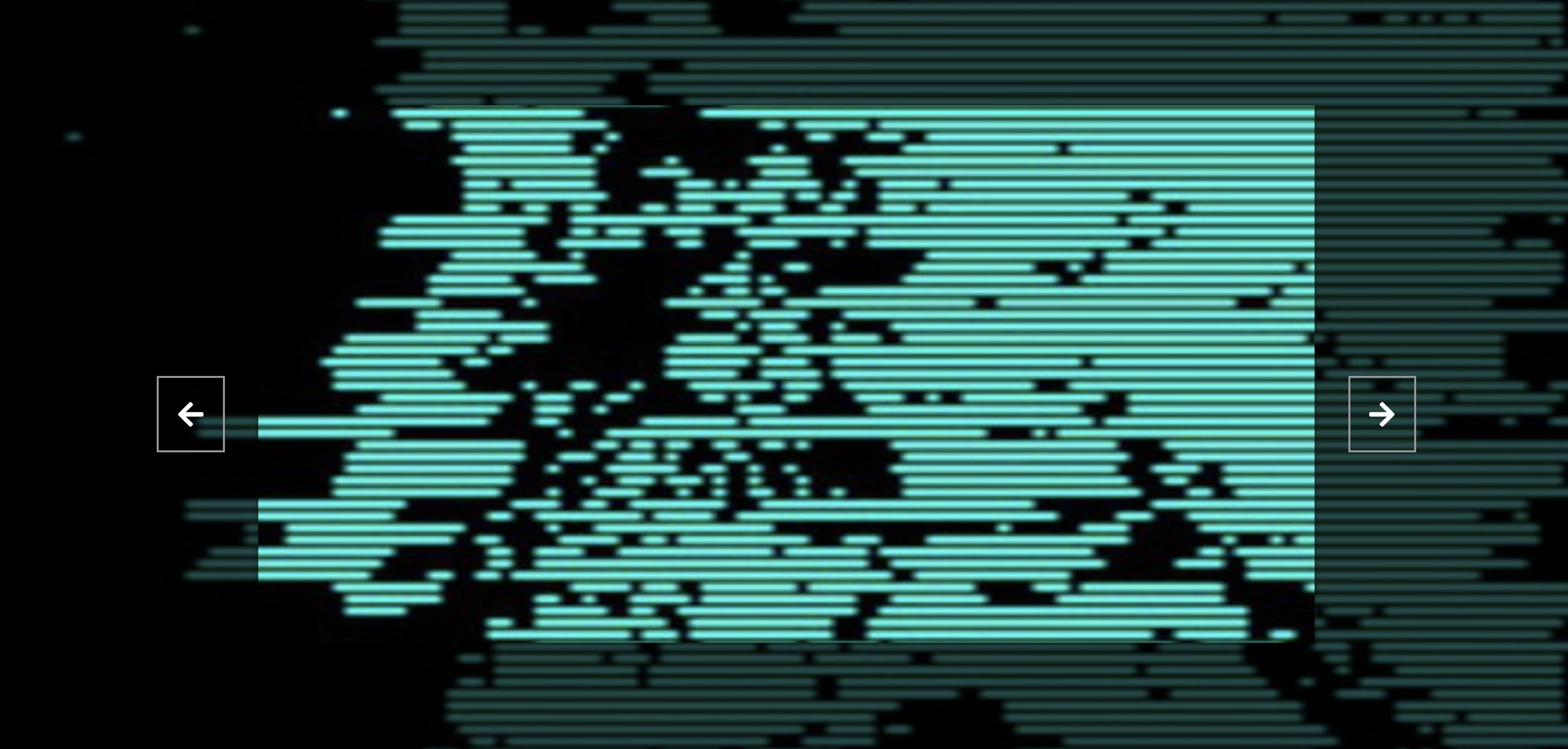
项目本体展示了一个简单的背景切换图片展示页.
效果:
2. 结构和切图
网页的基本结构如下:
1
2
3
4
5
6
7
8
9
10
11
12
13
14
15
16
17
18
19
20
21
22
23
24
25
26
27
<body>
    <div class="slider-container">
        <div class="slide active"
        style="background-image: url('../expanding-cards/avatar0.JPG');
        "></div>

        <div class="slide"
        style="background-image: url('../expanding-cards/avatar1.JPG');
        "></div>

        <div class="slide"
        style="background-image: url('../expanding-cards/avatar2.JPG');
        "></div>

        <div class="slide"
        style="background-image: url('../expanding-cards/avatar3.JPG');
        "></div>

        <button class="arrow left-arrow" id="left">
            <i class="fas fa-arrow-left"></i>
        </button>

        <button class="arrow right-arrow" id="right">
            <i class="fas fa-arrow-right"></i>
        </button>
    </div>
</body>
3. 编写 CSS 样式
首先设定 body 的排版方式, 并创建 body 的伪元素作为背景图片的半透明遮罩.
1
2
3
4
5
6
7
8
9
10
11
12
13
14
15
16
17
18
19
20
21
22
23
body {
    font-family: 'Roboto', sans-serif;
    display: flex;
    flex-direction: column;
    align-items: center;
    justify-content: center;
    height: 100vh;
    overflow: hidden;
    margin: 0;
    background-position: center center;
    background-size: cover;
    transition: 0.4s;
}
body::before {
    content: '';
    position: absolute;
    top: 0;
    left: 0;
    width: 100%;
    height: 100vh;
    background-color: rgba(0, 0, 0, .7);
    z-index: -1;
}
其次处理重点强调显示的图片容器样式. 由于在网页排版中我们将多张不同的图片依次放在子容器中, 我们需要指定容器的启用状态, 只允许 active 状态的容器显示.
1
2
3
4
5
6
7
8
9
10
11
12
13
14
15
16
17
18
19
20
21
22
.slider-container {
    box-shadow: 0 3px 6px rgba(0, 0, 0, .16), 0 3px 6px rgba(0, 0, 0, .23);
    height: 70vh;
    width: 65vw;
    position: relative;
    overflow: hidden;
}
.slide {
    opacity: 0;
    height: 100vh;
    width: 100vw;
    background-position: center center;
    background-size: cover;
    position: absolute;
    top: -15vh;
    left: -15vw;
    transition: .4s ease;
    z-index: 1;
}
.slide.active {
    opacity: 1;
}
然后处理切换图片的按键. 我们设定按键边框, 并使用 font-awesome 字体中的图标作为按键内容.
1
2
3
4
5
6
7
8
9
10
11
12
13
14
15
16
17
18
19
20
.arrow {
    position: fixed;
    background-color: transparent;
    color: #fff;
    padding: 20px;
    font-size: 30px;
    border: 2px solid #999999;
    top: 50%;
    transform: translateY((-50%));
    cursor: pointer;
}
.arrow:focus {
    outline: 0;
}
.left-arrow {
    left: calc(15vw - 65px);
}
.right-arrow {
    right: calc(15vw - 65px);
}
完整的 CSS 样式表如下:
1
2
3
4
5
6
7
8
9
10
11
12
13
14
15
16
17
18
19
20
21
22
23
24
25
26
27
28
29
30
31
32
33
34
35
36
37
38
39
40
41
42
43
44
45
46
47
48
49
50
51
52
53
54
55
56
57
58
59
60
61
62
63
64
65
66
67
68
69
70
71
* {
    box-sizing: border-box;
}

body {
    font-family: 'Roboto', sans-serif;
    display: flex;
    flex-direction: column;
    align-items: center;
    justify-content: center;
    height: 100vh;
    overflow: hidden;
    margin: 0;
    background-position: center center;
    background-size: cover;
    transition: 0.4s;
}
body::before {
    content: '';
    position: absolute;
    top: 0;
    left: 0;
    width: 100%;
    height: 100vh;
    background-color: rgba(0, 0, 0, .7);
    z-index: -1;
}

.slider-container {
    box-shadow: 0 3px 6px rgba(0, 0, 0, .16), 0 3px 6px rgba(0, 0, 0, .23);
    height: 70vh;
    width: 65vw;
    position: relative;
    overflow: hidden;
}
.slide {
    opacity: 0;
    height: 100vh;
    width: 100vw;
    background-position: center center;
    background-size: cover;
    position: absolute;
    top: -15vh;
    left: -15vw;
    transition: .4s ease;
    z-index: 1;
}
.slide.active {
    opacity: 1;
}

.arrow {
    position: fixed;
    background-color: transparent;
    color: #fff;
    padding: 20px;
    font-size: 30px;
    border: 2px solid #999999;
    top: 50%;
    transform: translateY((-50%));
    cursor: pointer;
}
.arrow:focus {
    outline: 0;
}
.left-arrow {
    left: calc(15vw - 65px);
}
.right-arrow {
    right: calc(15vw - 65px);
}
4. JavaScript
最后, 我们编写 JavaScript 函数:
1
2
3
4
5
6
7
8
9
10
11
12
13
14
15
16
17
18
19
20
21
22
23
24
25
26
27
28
29
30
31
32
33
34
35
36
37
38
39
40
41
42
43
const body = document.body;
const slides = document.querySelectorAll('.slide');
const leftBtn = document.getElementById('left');
const rightBtn = document.getElementById('right');
let activeSlide = 0;

// listen click event on left arrow btn
leftBtn.addEventListener('click', () => {
    // ptr -= 1
    activeSlide--;

    // reset ptr for looping
    if (activeSlide < 0) {
        activeSlide = slides.length - 1;
    }
    setBgToBody();
    setActiveSlide();
})

// listen click event on right arrow btn
rightBtn.addEventListener('click', () => {
    // ptr += 1
    activeSlide++;

    // reset ptr for looping
    if (activeSlide > slides.length - 1) {
        activeSlide = 0;
    }
    setBgToBody();
    setActiveSlide();
})

// initialize
setBgToBody();

function setBgToBody() {
    body.style.backgroundImage = slides[activeSlide].style.backgroundImage;
}
function setActiveSlide() {
    slides.forEach((slide) => slide.classList.remove('active'));
    slides[activeSlide].classList.add('active');
}
最后, 完整的网页演示可见 此处